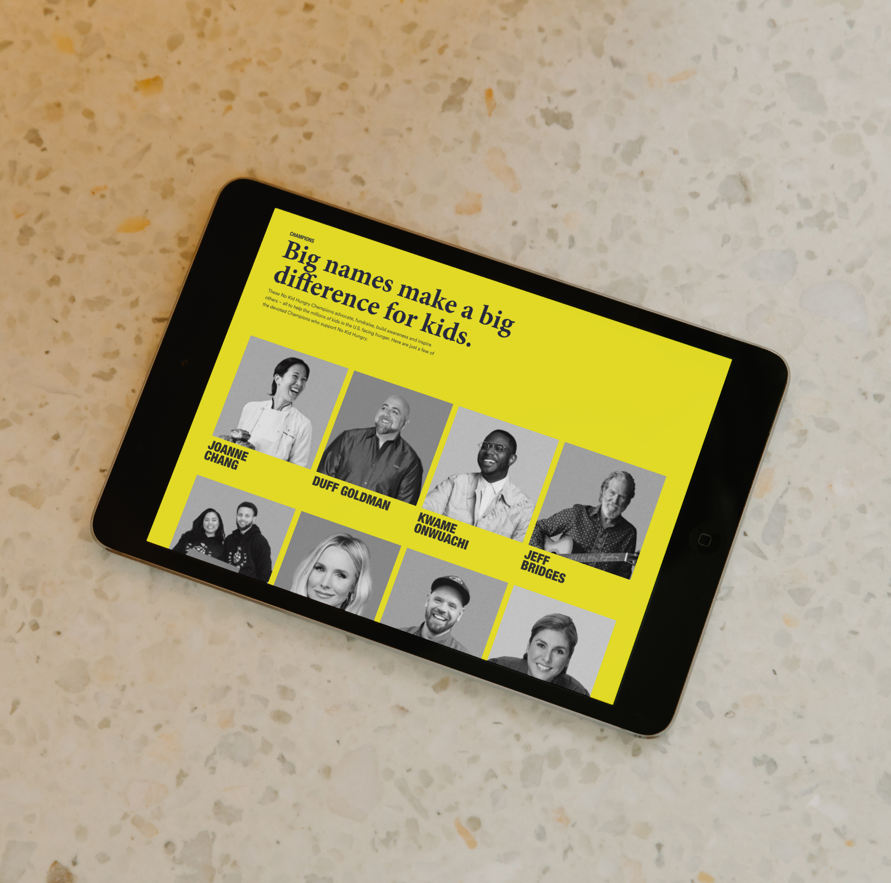
Share Our Strength
Visit the website
The research
The Challenge
Rebalance the portfolio.
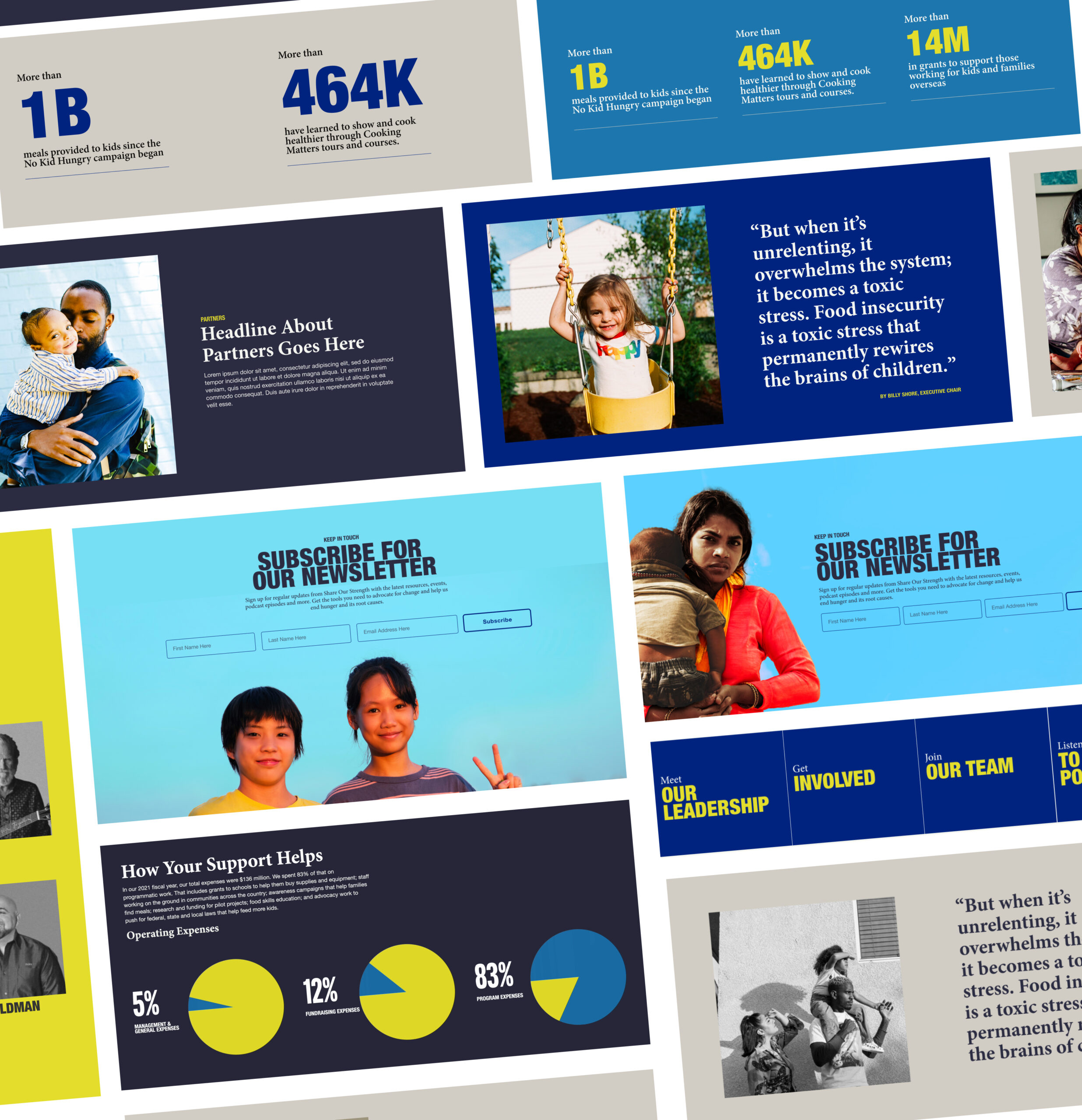
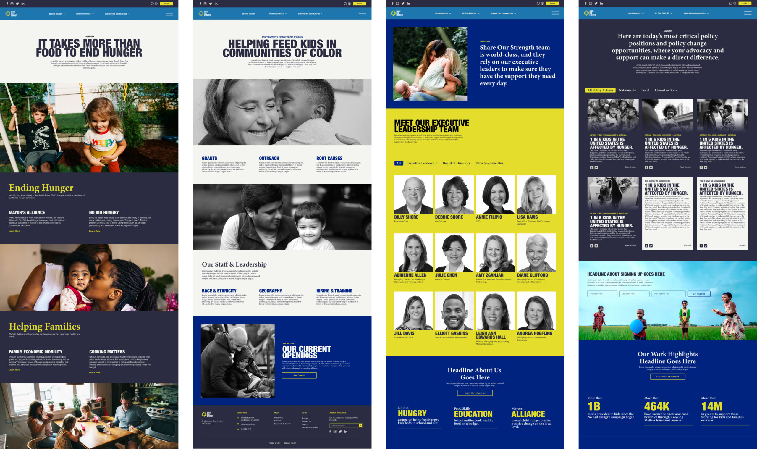
Share Our Strength’s portfolio contains a wealth of programs and initiatives with the majority of funding and resources attributed to No Kid Hungry. Rebalancing their portfolio made space for key programs and initiatives to grow with clear distinctions and hierarchy between their primary and secondary programming, as well as their content series. When considering the organization’s future, it was important for Share Our Strength to have a web tool that allows enough space for the organization to expand and continue its evolution.
Key Features
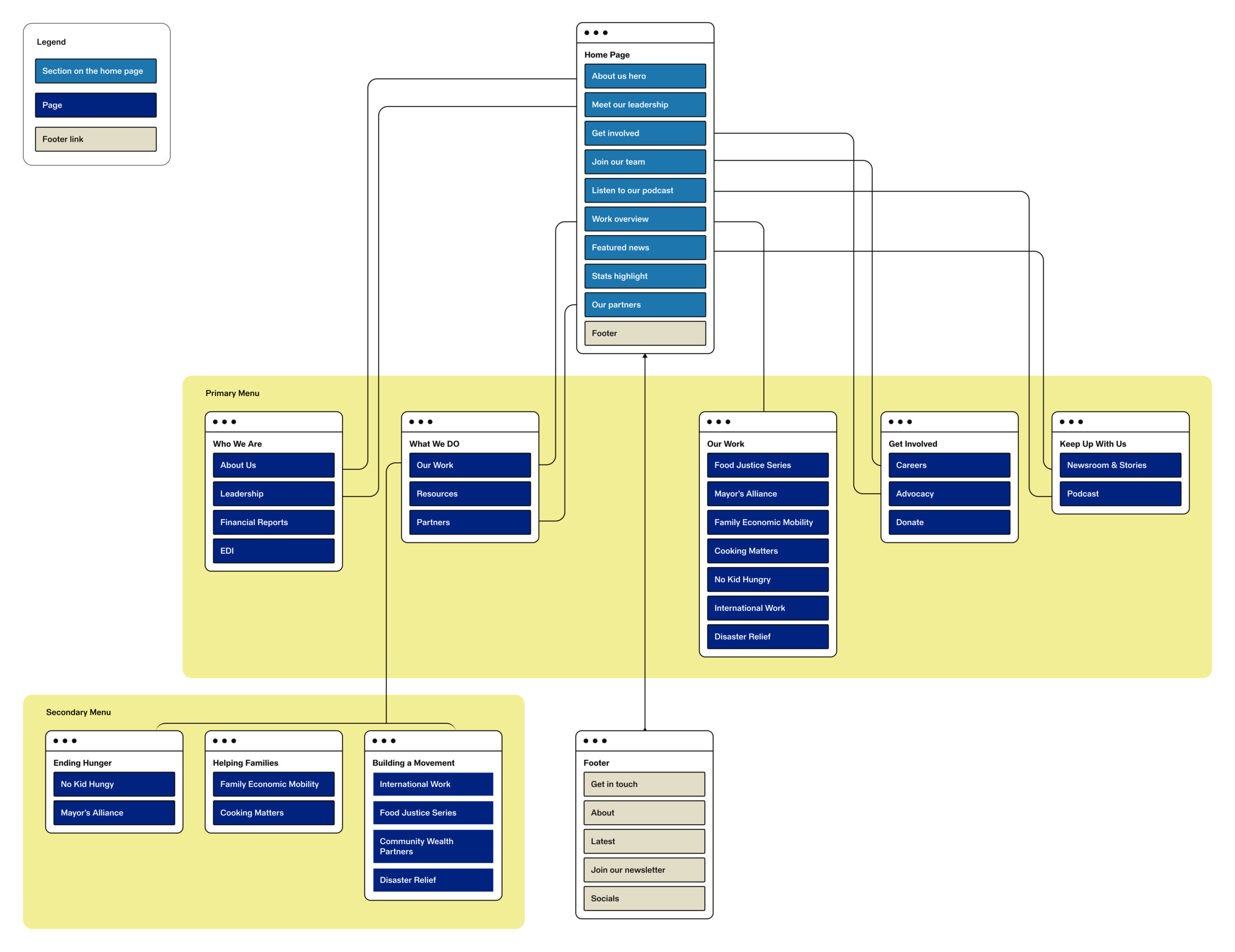
Sitemap
Organizing initiatives with user flow at the center.
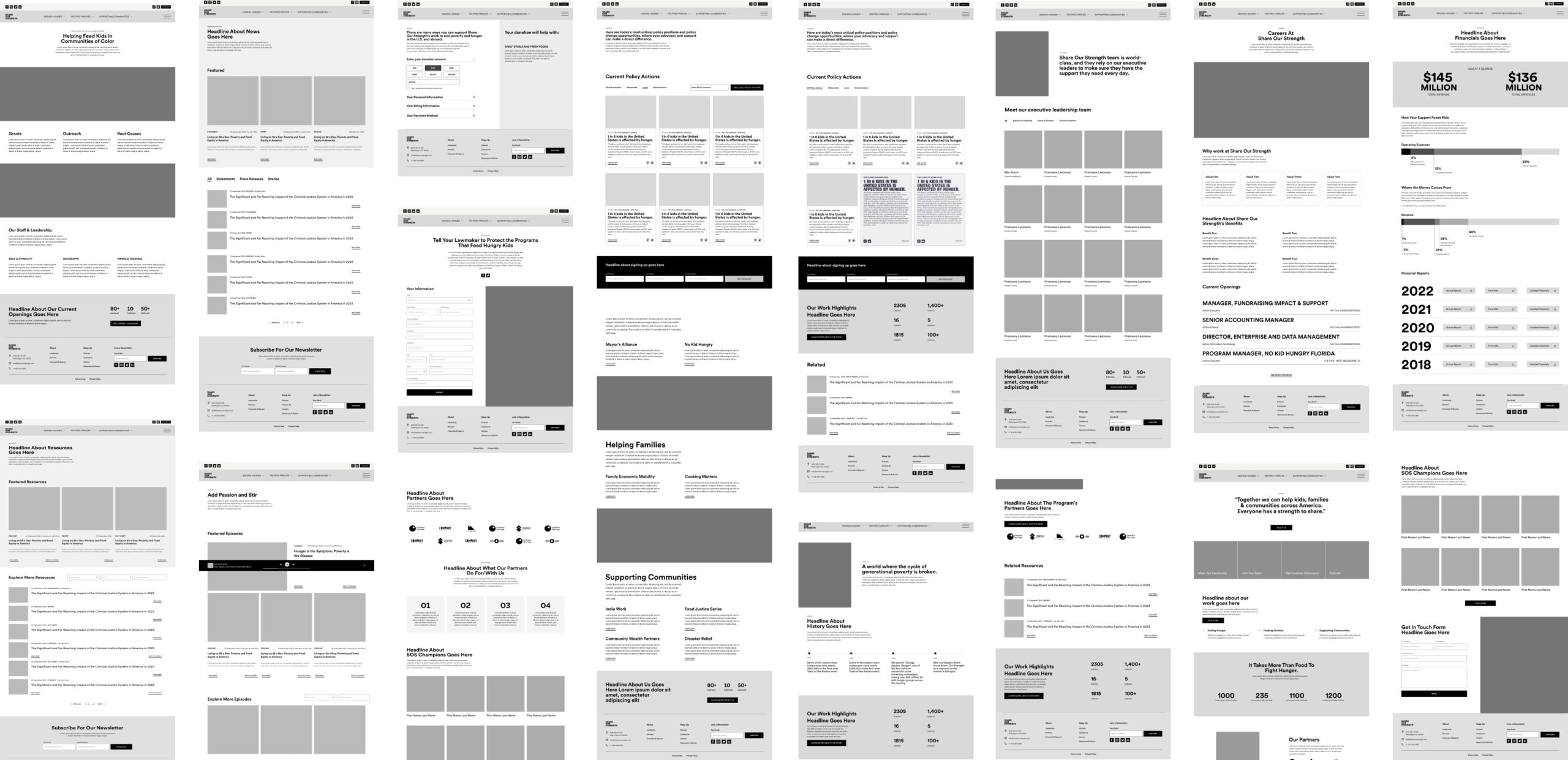
Wireframes
During the wireframe development process, we carefully deliberated on several essential aspects to effectively tackle the challenge of rebalancing the organization’s portfolio while allowing for growth moving forward. Our foremost priority was crafting wireframes that provided flexibility within their components, allowing for seamless element reuse across the entire website. Additionally, we placed a strong emphasis on structuring content in a manner that facilitates easy access to information while keeping the user thoroughly engaged.
Navigation
Primary & Secondary navigation.
The primary menu serves as the main navigation hub, providing the user with quick access to essential pages and core sections of the site. The secondary menu, specifically dedicated to Share Our Strength’s initiatives, allows the user to quickly view the entirety of their work. This versatility allows for more comprehensive content organization and ensures that users can find specific information or access specialized features conveniently. In combination, these menus create a seamless browsing experience, catering to both the immediate needs of users and more detailed, niche interests— ultimately enhancing the website’s usability and effectiveness.
Design Elements
Designed with longevity and flexibility in mind.
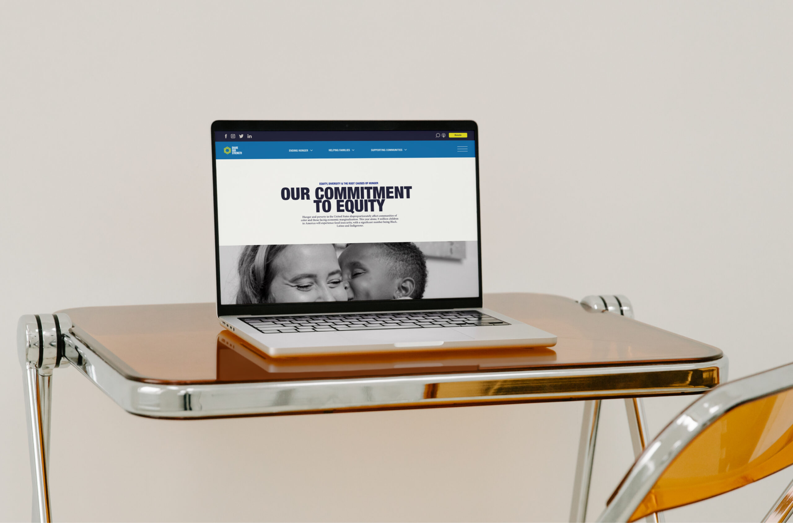
Utilizing the brand Tantrum created, we decided to create a simple design system to be used throughout the entire design. We knew that would establish a consistent and cohesive visual identity, ensuring that all elements of the site align with the brand’s aesthetics, typography, and color schemes. Especially since the website is one of the ways Share Our Strength would reveal their re-brand to the digital world.
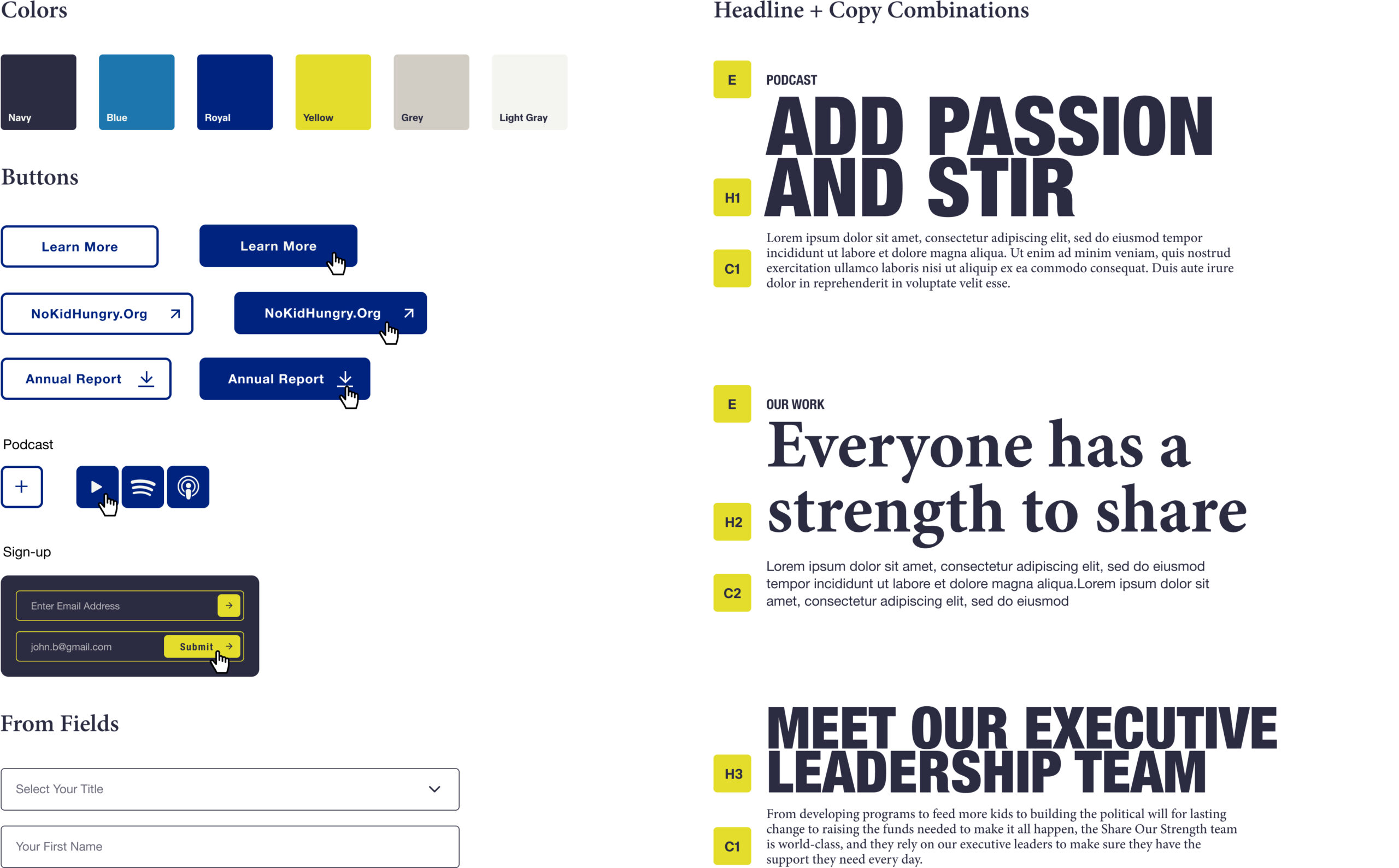
Flexible Components
The flexible components within the design system were a central element of our strategy. They helped us streamline the development process, saving time and resources by providing a library of pre-defined, reusable components and styles. This approach fostered collaboration with the development team, and created a single source of truth which reduced the chances of inconsistencies. Additionally, the design system enhances scalability, making it easier to expand or update the website in the future while maintaining its overall look and feel.
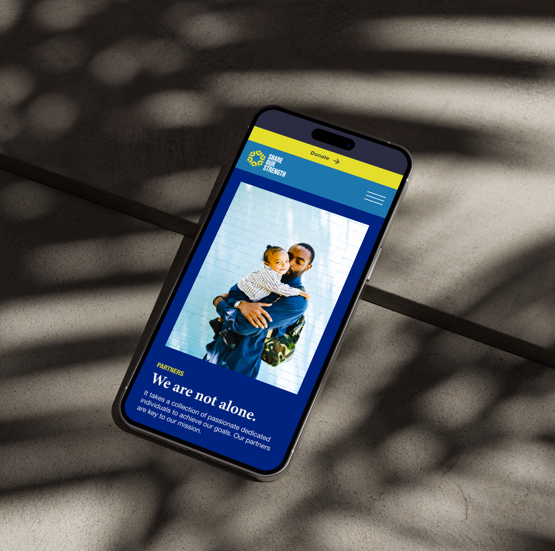
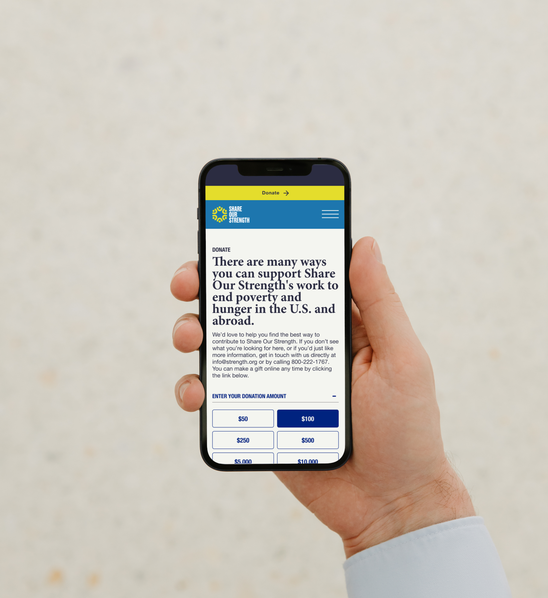
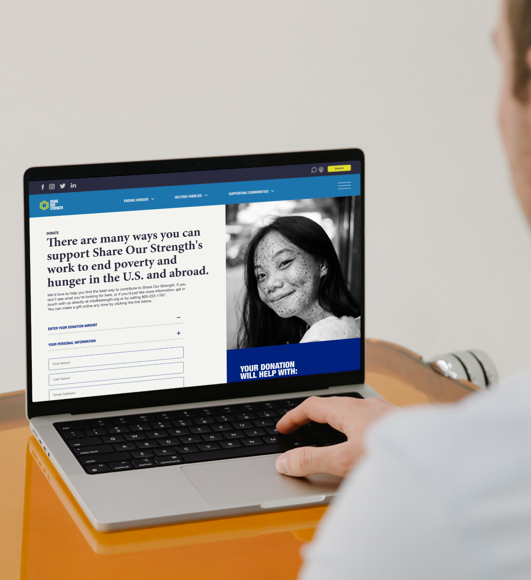
Donate & Support
Multi-step Custom Donate Form.
Customization allowed for tailored user experiences, ensuring that the form aligns perfectly with the organization’s branding and messaging. This fosters trust and recognition among donors, potentially increasing their willingness to contribute. The custom form also enabled the organizations to collect specific data from donors, facilitating personalized communication and stewardship.
UI Design
The UI design played a pivotal role in shaping the overall user experience, flexibility, and engagement of this website. Every component was meticulously crafted with the intention of fostering consistency and reinforcing the brand’s identity. The subtle hover effects and dynamic motion elements were strategically incorporated to captivate and sustain the user’s interest, creating an enticing and memorable encounter with the brand.
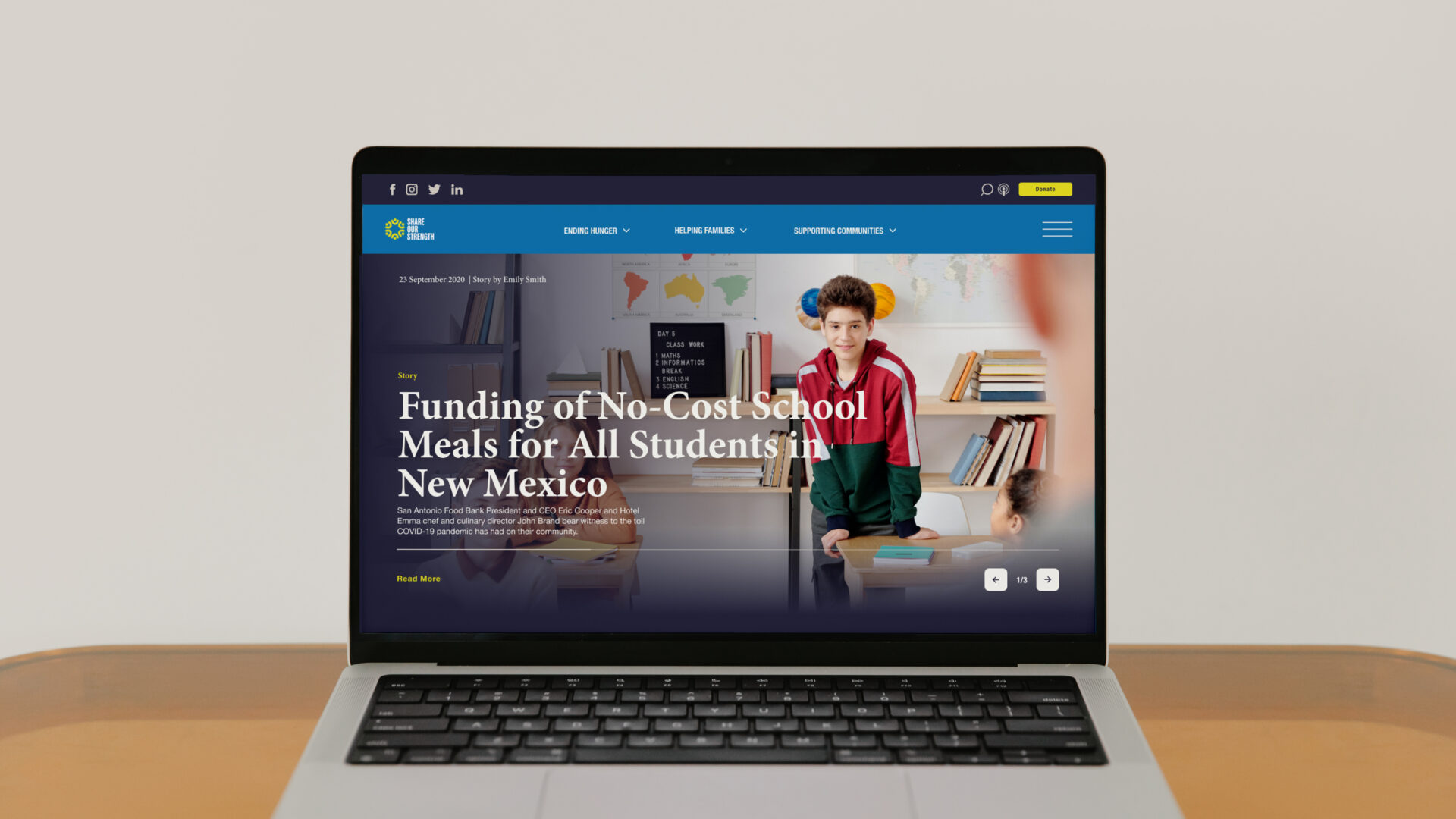
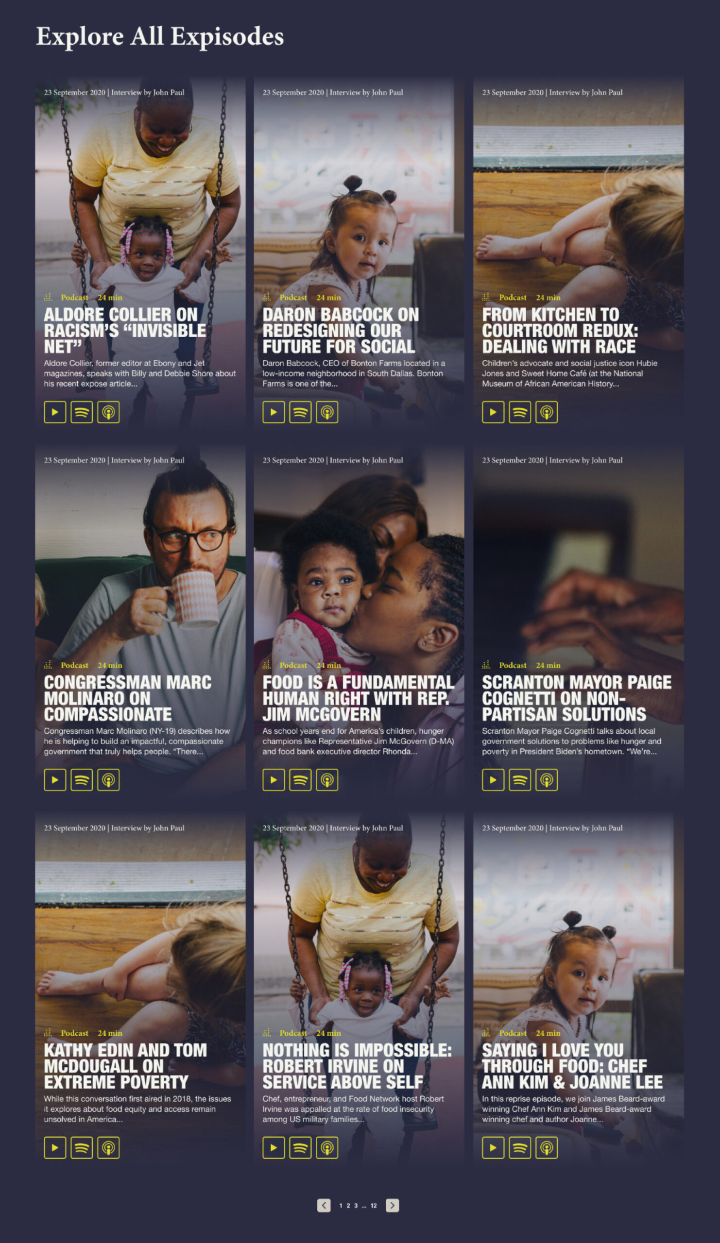
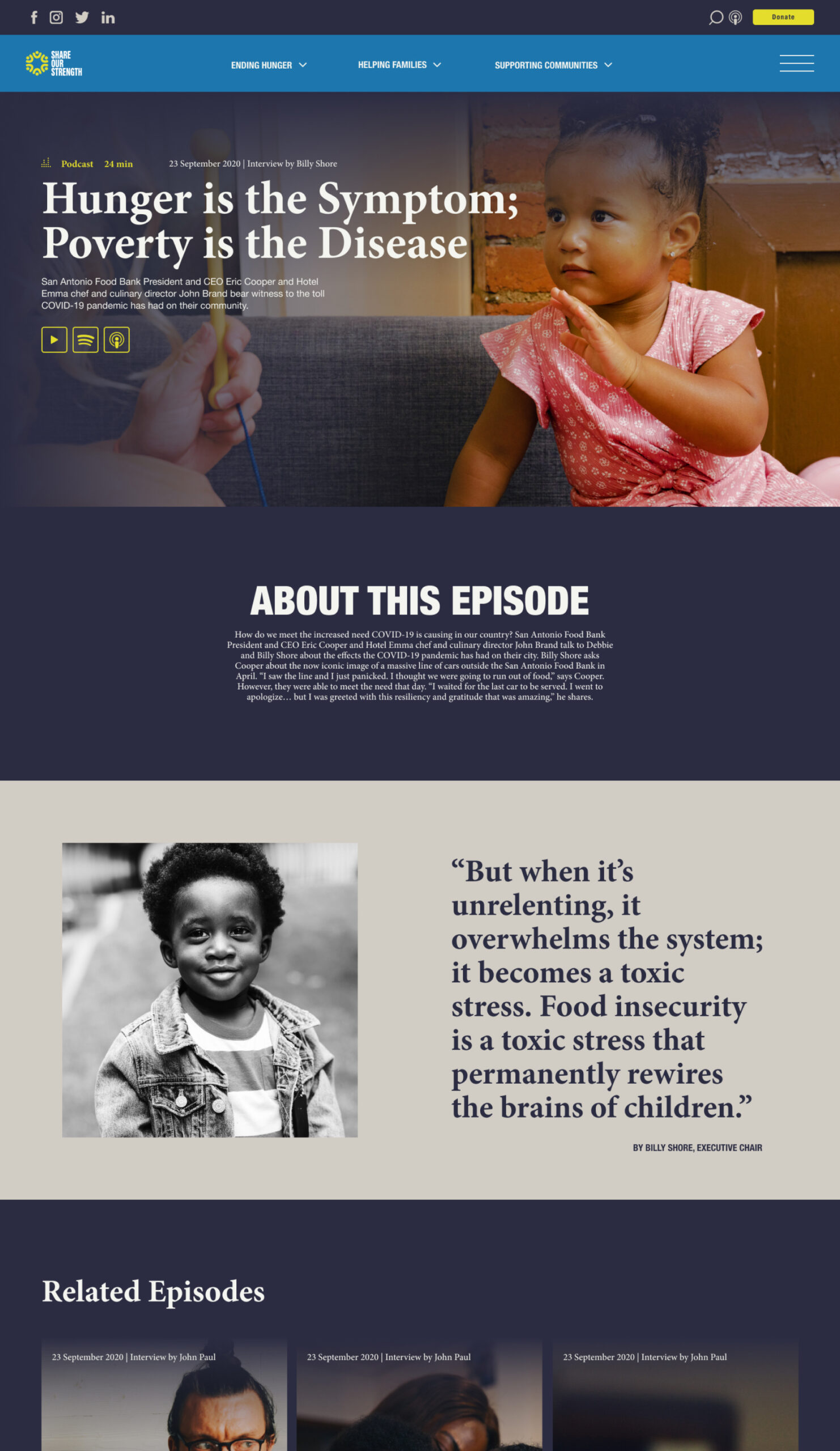
Podcast
In our analytics audit and discovery sessions with the organization, the Podcast was both a highly-visited page and a feature to prioritize. We made sure that the user can land on this page from multiple locations on the site. An important element of the design was the podcast player which proved beneficial in enhancing the the overall experience. This player enables users to listen to episodes while simultaneously exploring the website, providing a multi-tasking capability that keeps visitors engaged and encourages prolonged interaction with the content.
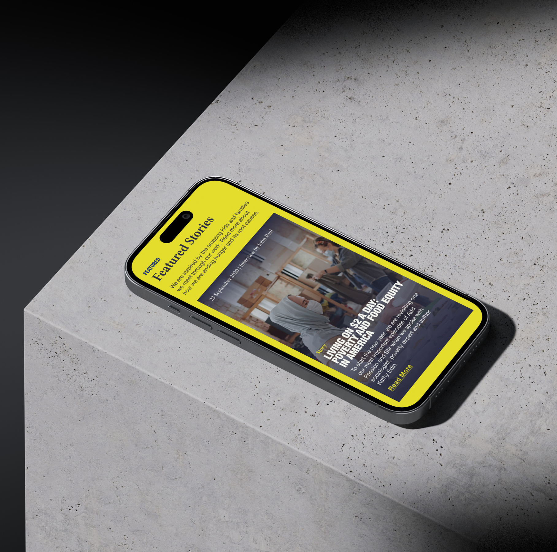
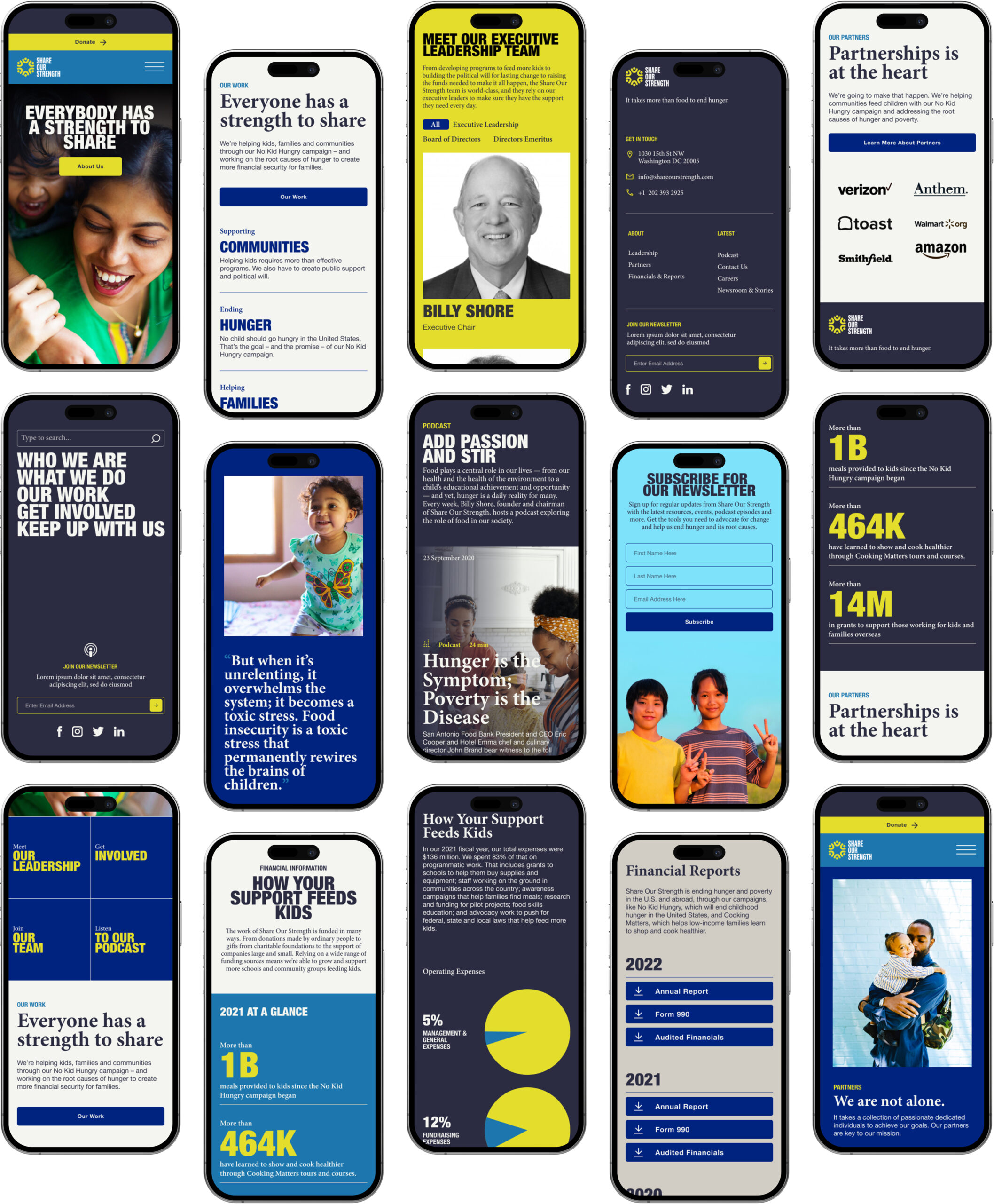
Mobile First Approach.
Aside from emphasizing design flexibility, our goal was to ensure the seamless adaptability of all components across a range of screen sizes, with a special emphasis on optimizing the experience for mobile devices. To achieve this, we implemented several adjustments, such as incorporating full-width buttons and taller images. For podcast-related enhancements, we strategically relocated the play buttons to the right side, a modification that significantly improved accessibility for mobile users, making it easier for them to enjoy the content.