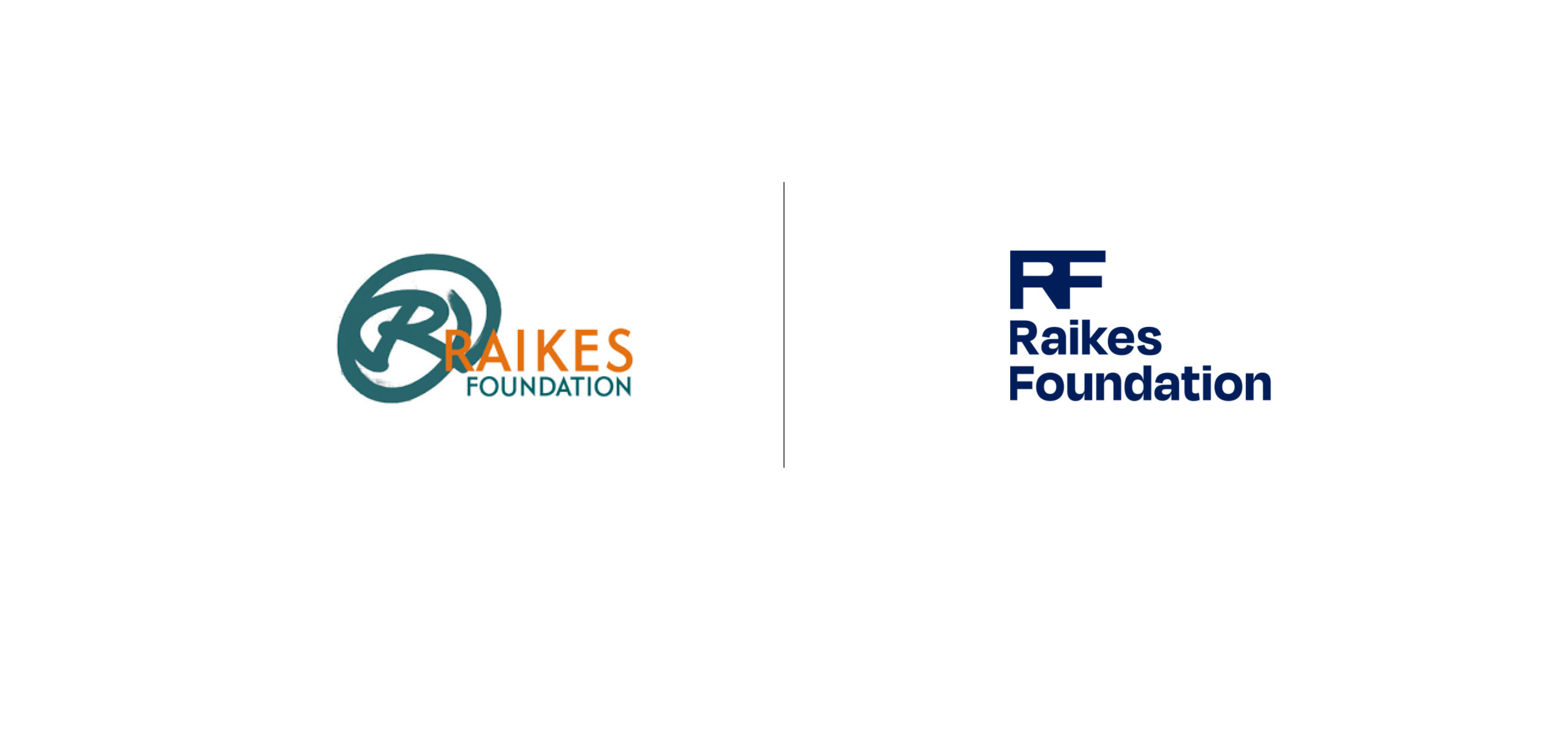
Raikes Foundation
Overview
The Seattle-based Raikes Foundation hired Ghost Note to craft a new brand identity in support of the organization’s renewed commitments to further driving racial and gender equity. Founded by long-time Microsoft executives and philanthropists Jeff and Tricia Raikes, the Foundation tasked our agency with creating a bold new brand that signifies its ongoing mission of bridge-building and innovative leadership amongst America’s most influential philanthropists and nonprofits.
Challenge
Ghost Note had the opportunity to create a balanced brand that invites progressive energy without pandering or feeling overly formal. We strived to ensure that the bright, punchy energy of the former brand was reinvented with a vision of expansion, maturity, and respect. Including the legacy of the Foundation in the feel of the final identity, while providing something fresh and contemporary, was a top priority as we brought this brand to life.
A Clear Path Forward
A rebrand is an opportunity for any organization to gain clarity, alignment, and energy around its purpose and the communities it serves. Ghost Note facilitated interviews and focus groups with Raikes Foundation’s stakeholders to develop a new mission, vision, and theory of change their full team could rally behind. With a clear purpose, audience messaging guidelines, and brand positioning, the new strategic framework set the foundation for how the Raikes Foundation shows up in the world.
Building Bridges
We looked at the geometry and structure in bridges to center the concept around the strength that’s built from connection. Using bridges as inspiration created a foundation on which to build feelings of warmth, humanity, and partnership through bold play with shape and color.
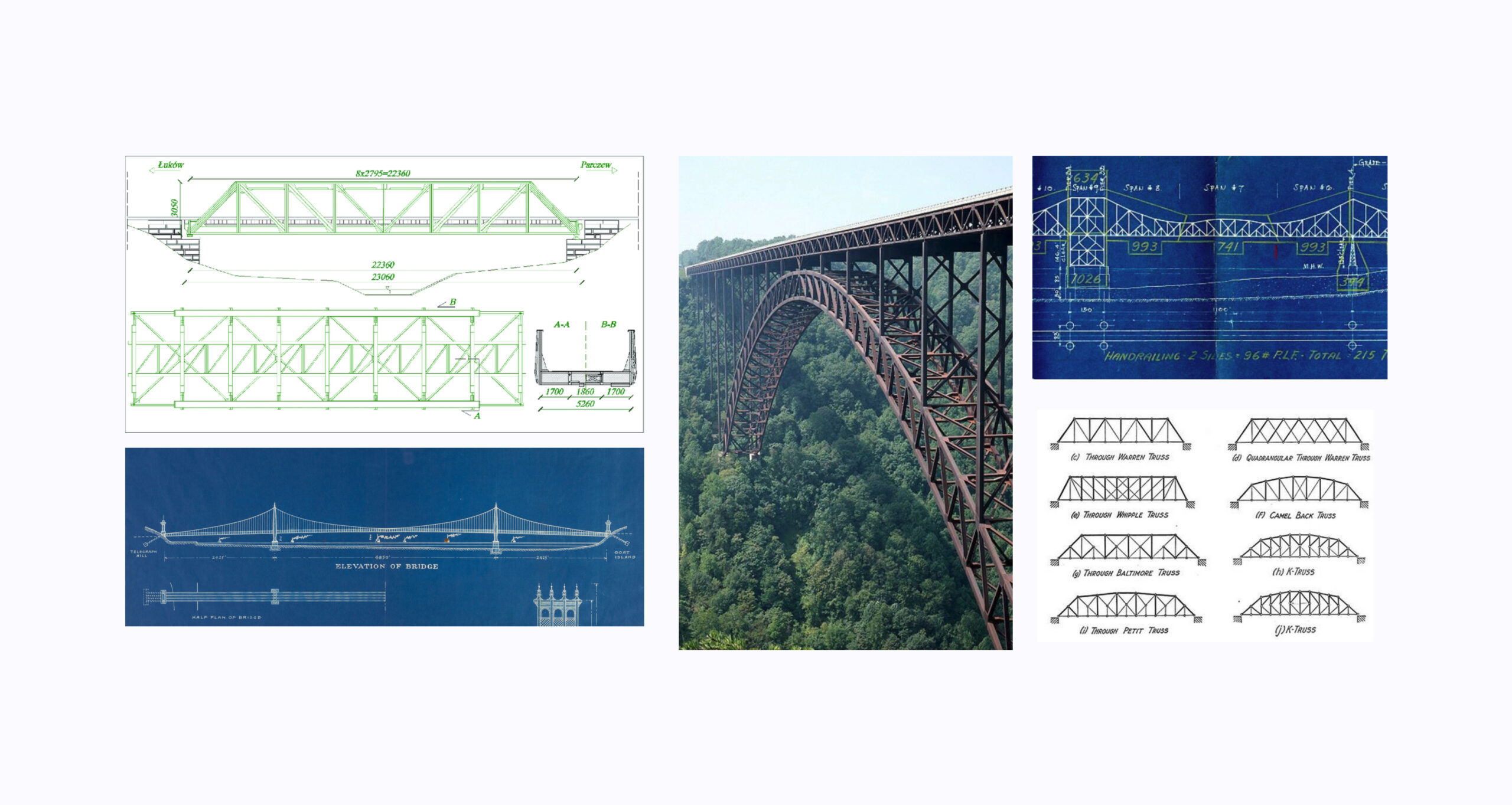
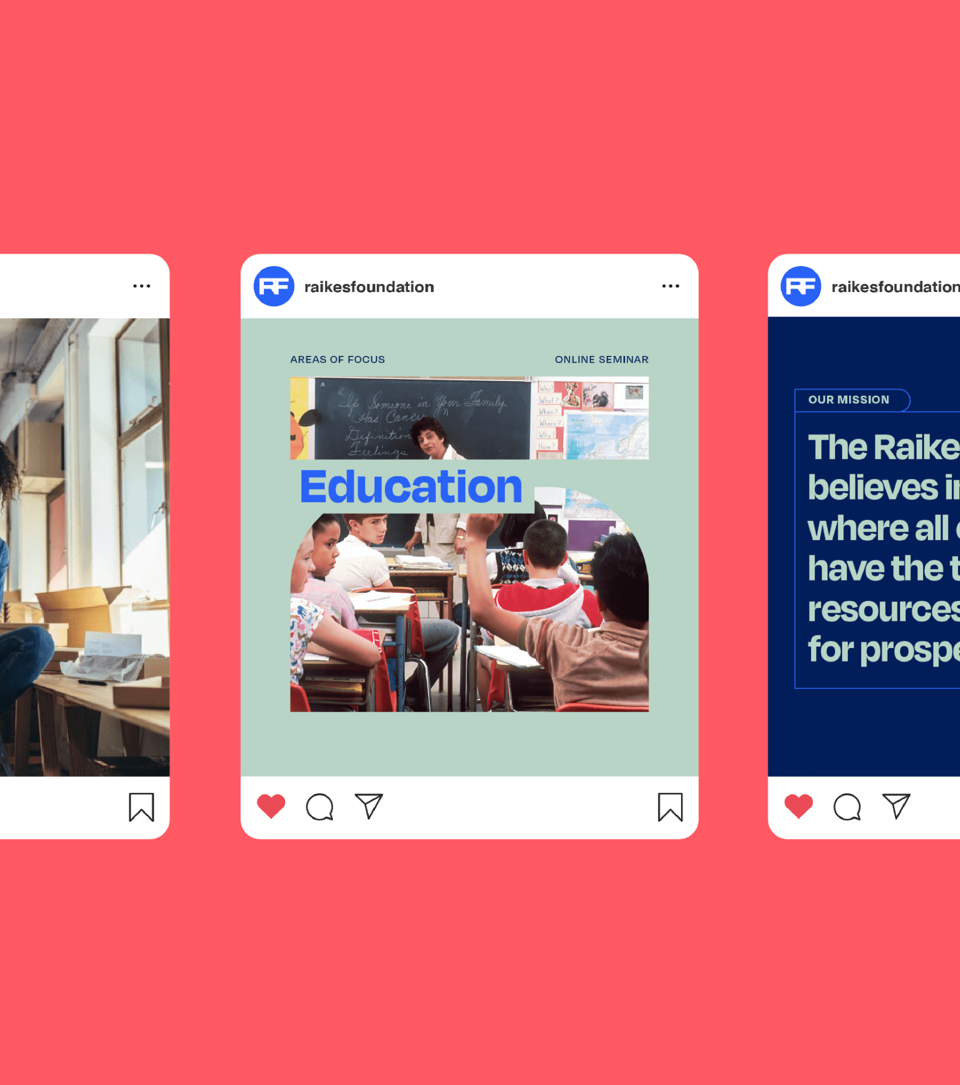
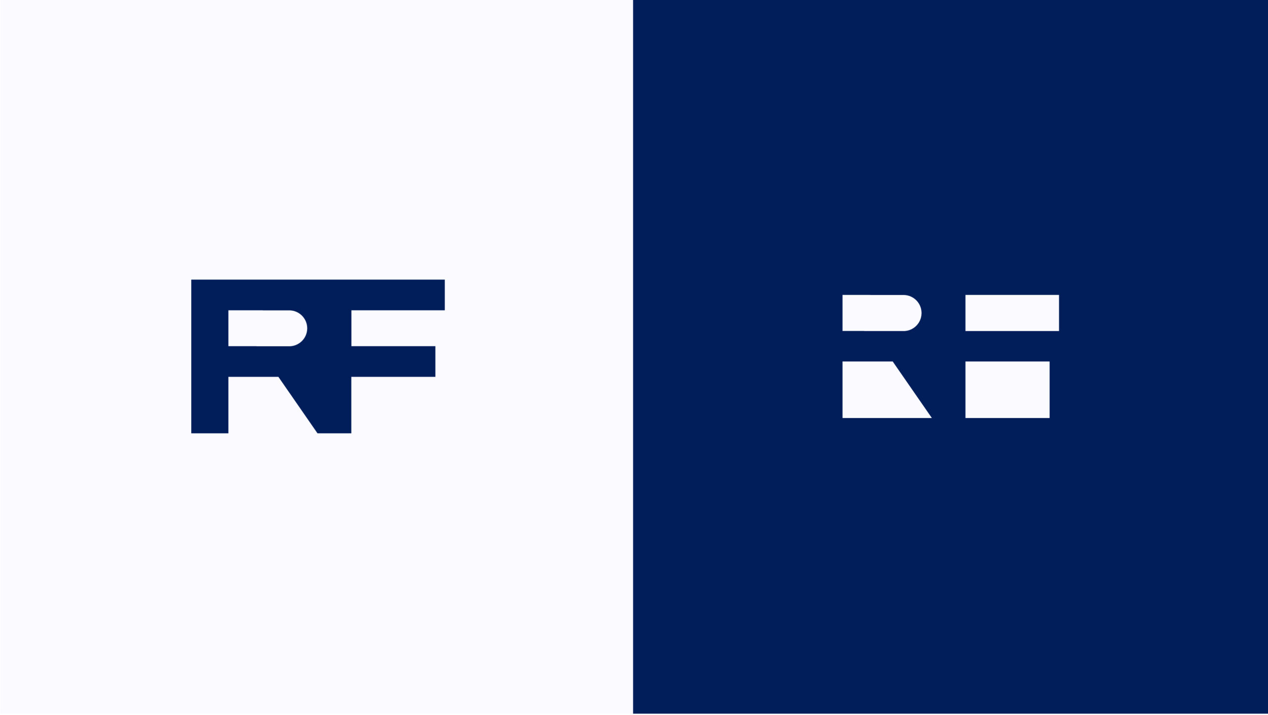
Structure, Equality, Connection
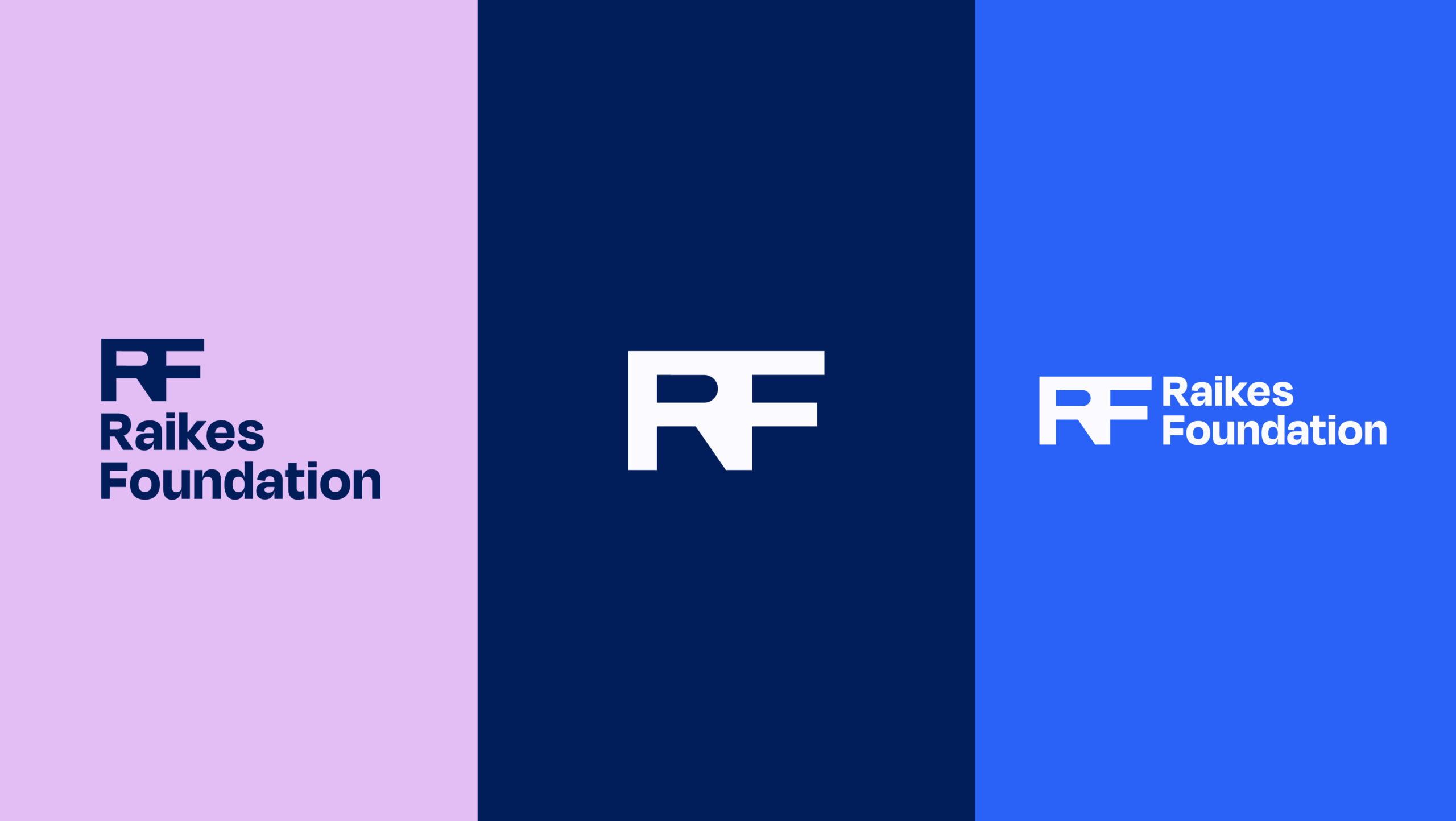
Inspired by architectural elements, the RF mark emphasizes ideas of outreach, iteration, growth, and continual build. It also resembles a bridge, an intersection, a crossroads; symbolizing Raikes’ role in developing powerful networks that connect ideas and people across sectors and disciplines. This mark acts as a base for the entire visual language of the brand.
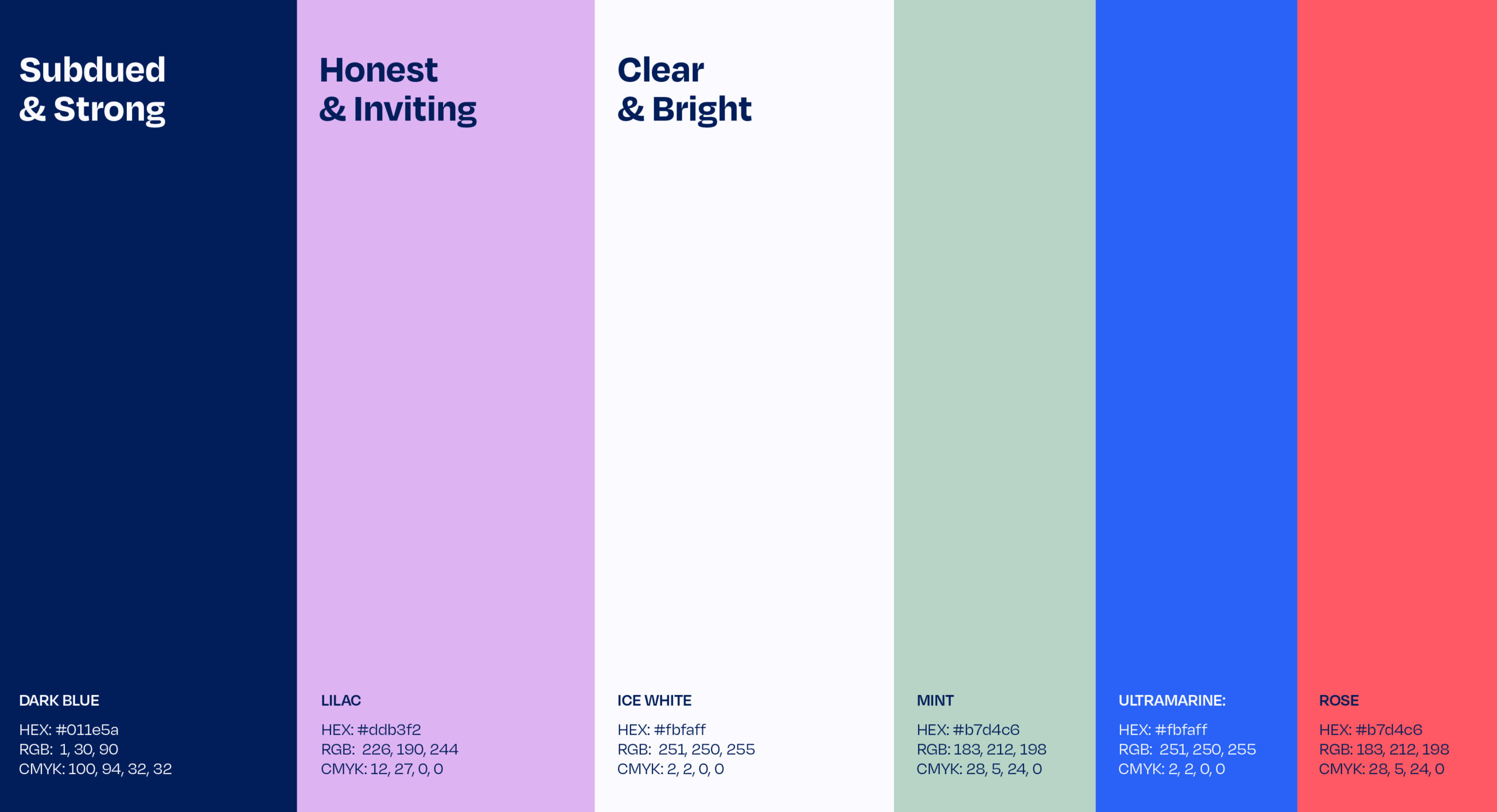
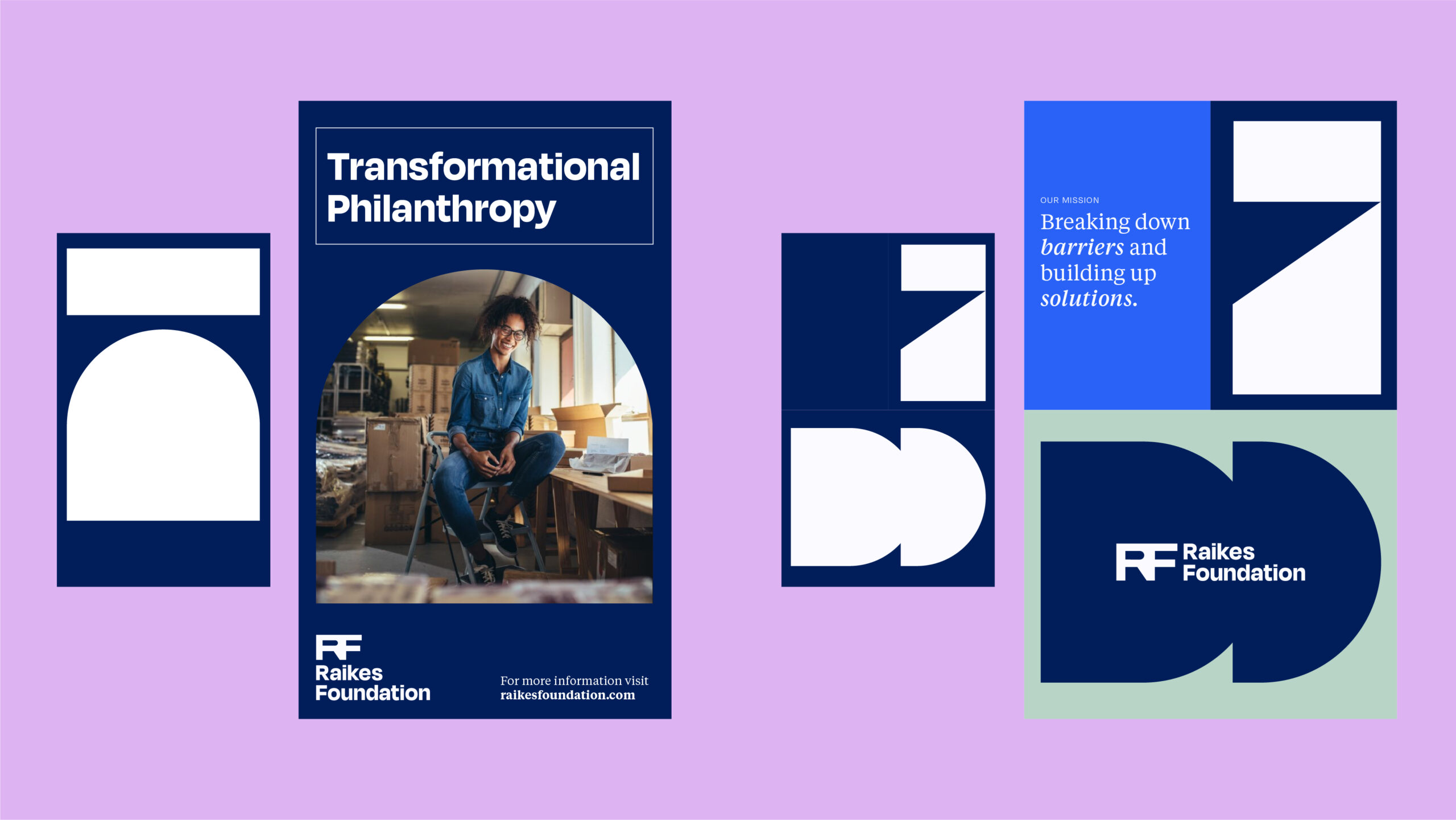
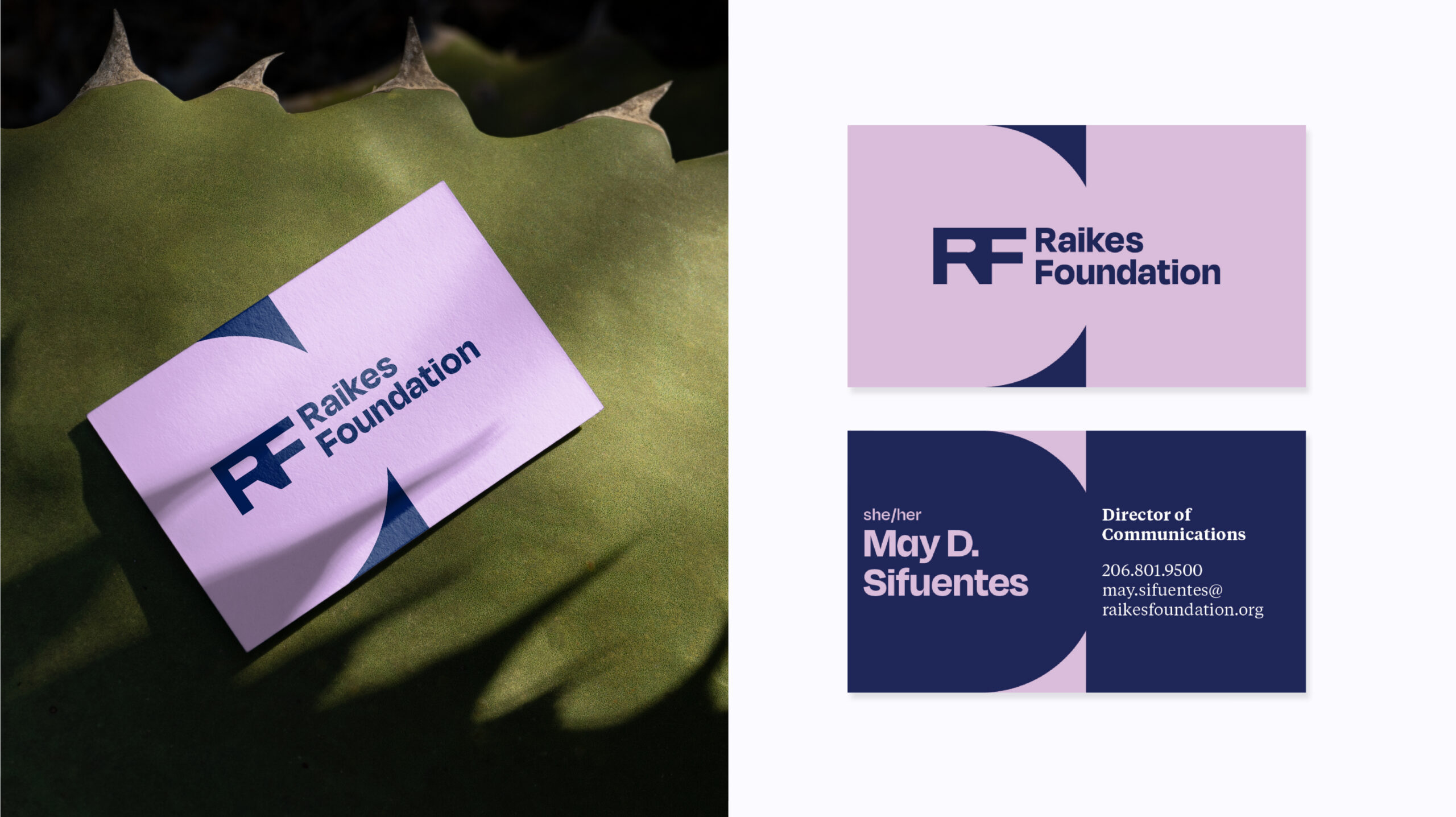
Color
The palette feels approachable and clear through its use of saturated tones grounded in warm blues. In use, the color combinations feel motivated without sacrificing their inviting quality.
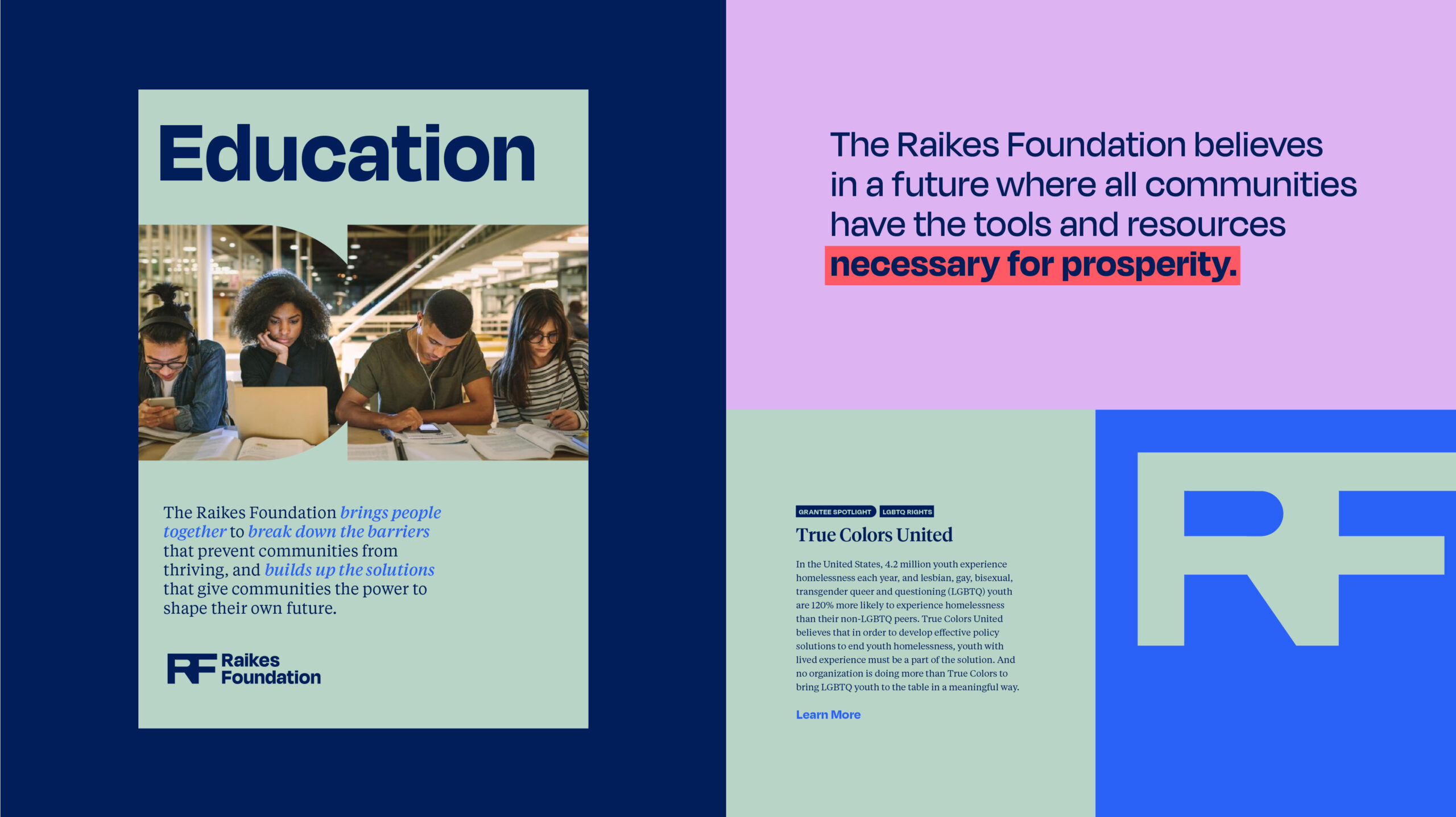
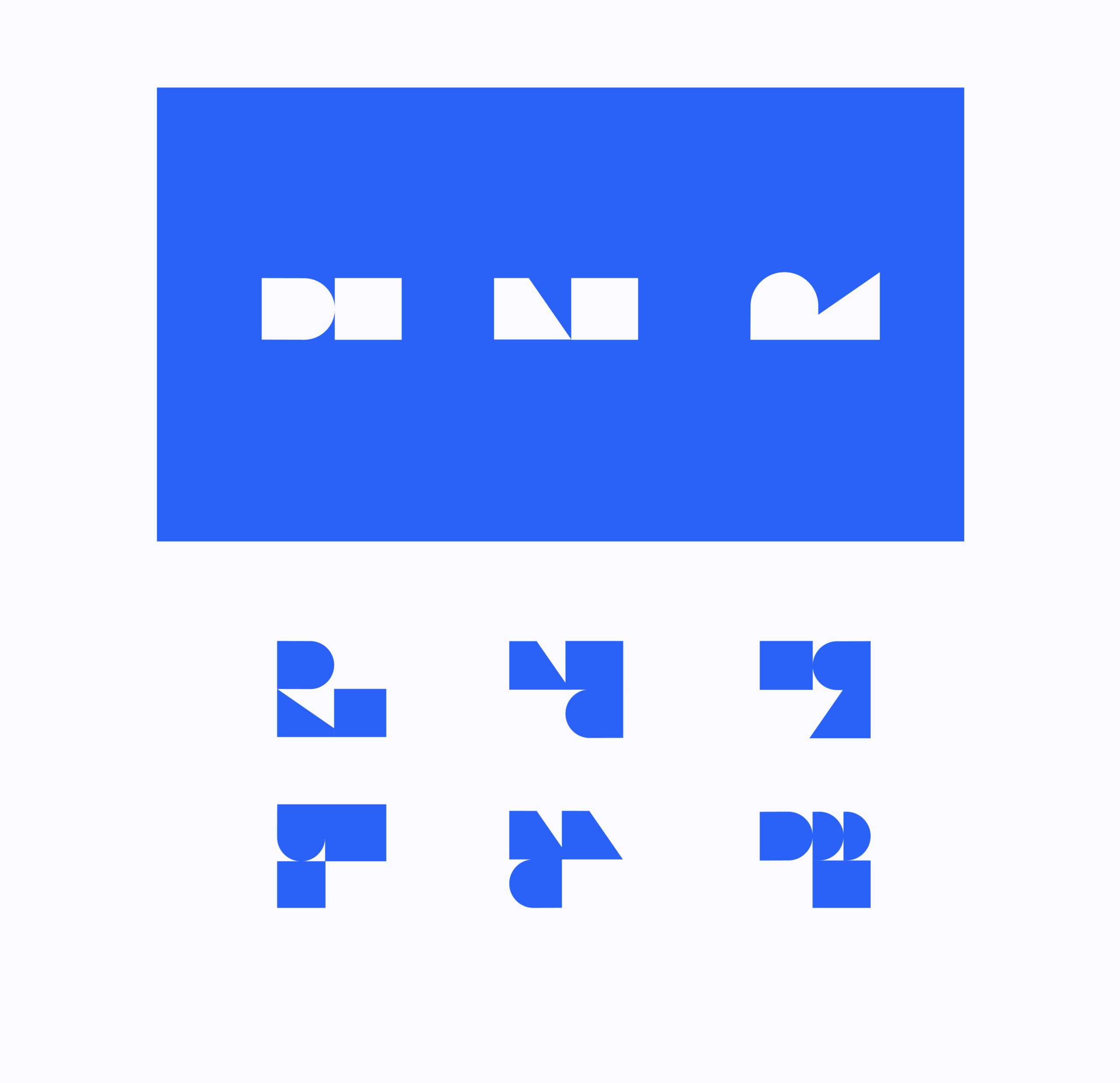
Connecting Shapes
The “Bridge Shapes” are derived from the negative space of the logomark, and are central to the brand’s visual language. The shapes can be mixed, matched, combined, and shifted to create a wide variety of patterns and compositions. Inspired by the central brand themes of “bridging” and “joining together,” these disparate parts unite to create a modular system that will keep the Raikes brand feeling fresh and future-facing for years to come.
Integrating Shapes
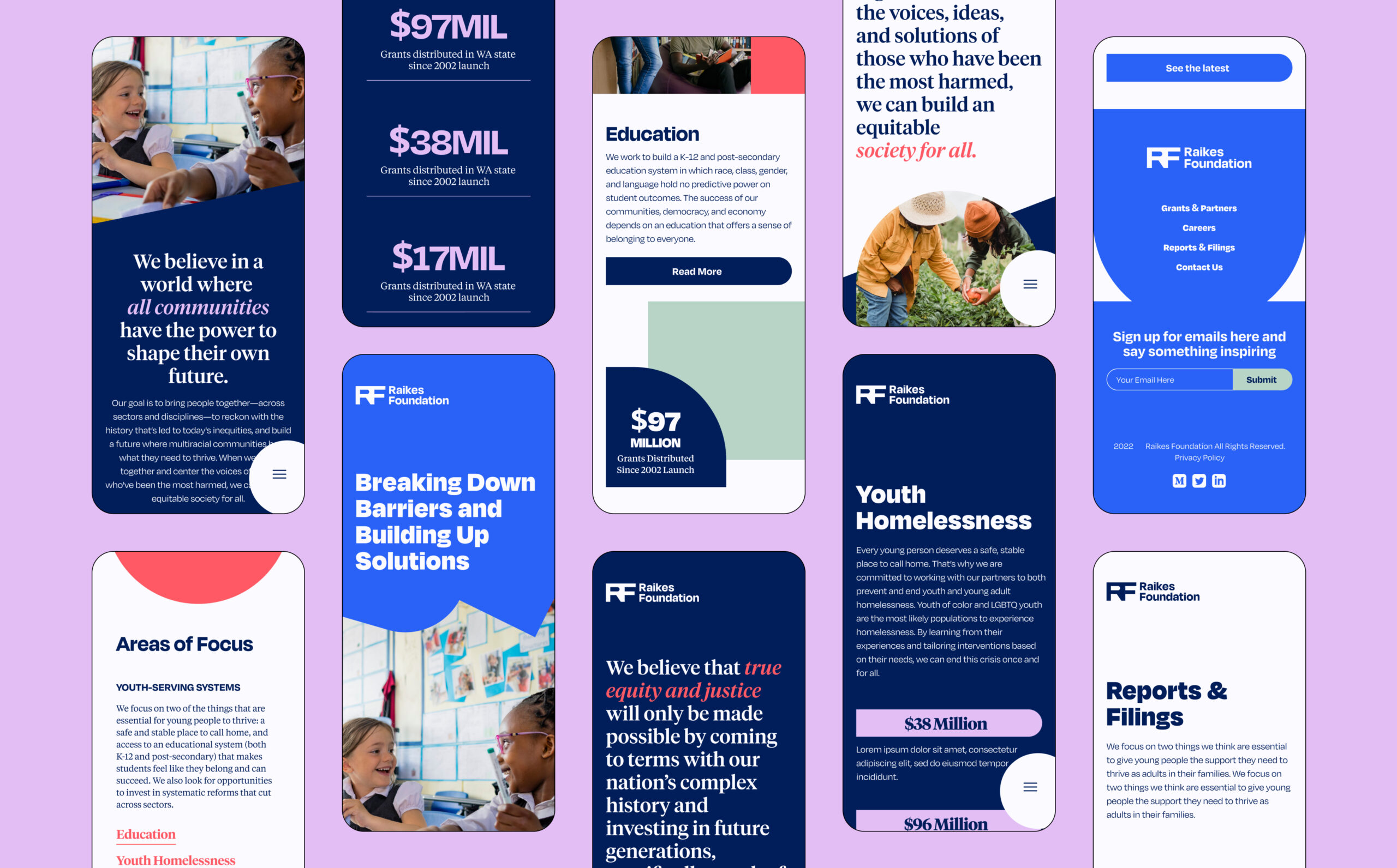
Applying the Bridge Shapes to the website was an opportunity to expand consistency and allowed us to bring the brand’s core concept to life through movement. We created moments in the UI where shapes shift to reinforce the bridging theme— often represented by a movement from left to right, or two shapes uniting in the center. We also represented the bridge concept by intersecting shapes and photos throughout the site to create an overall feeling of unity.
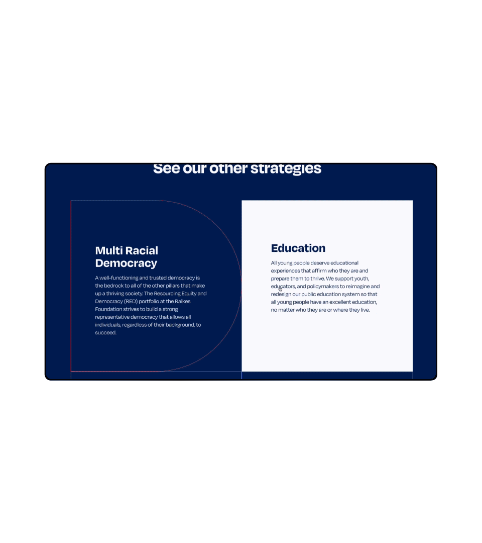
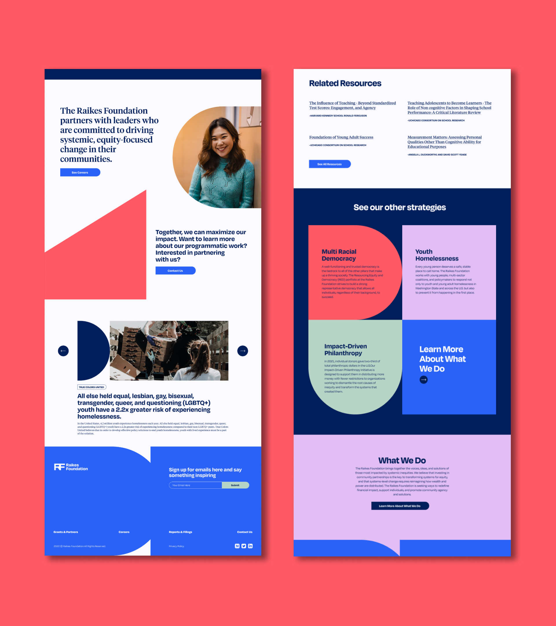
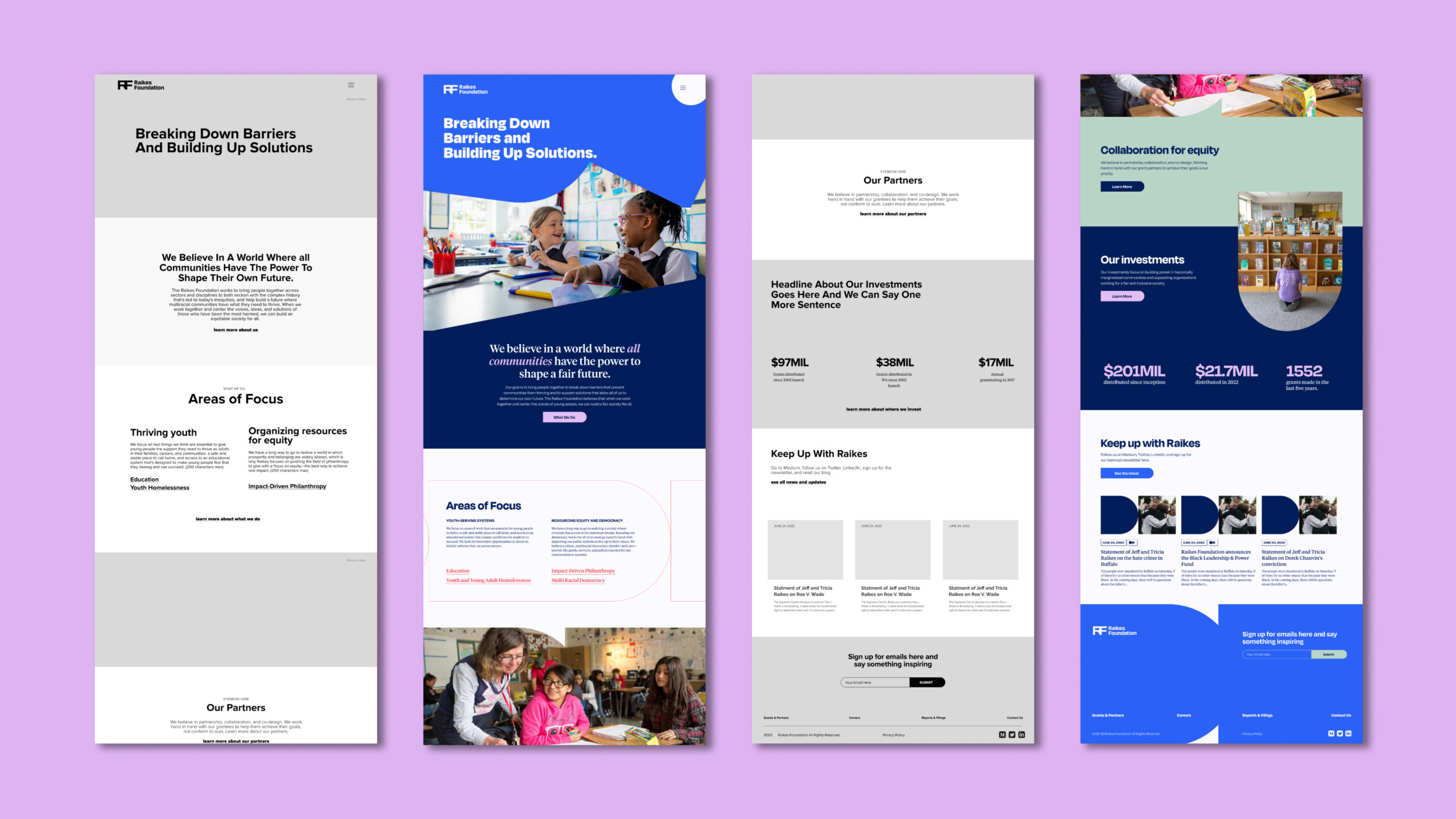
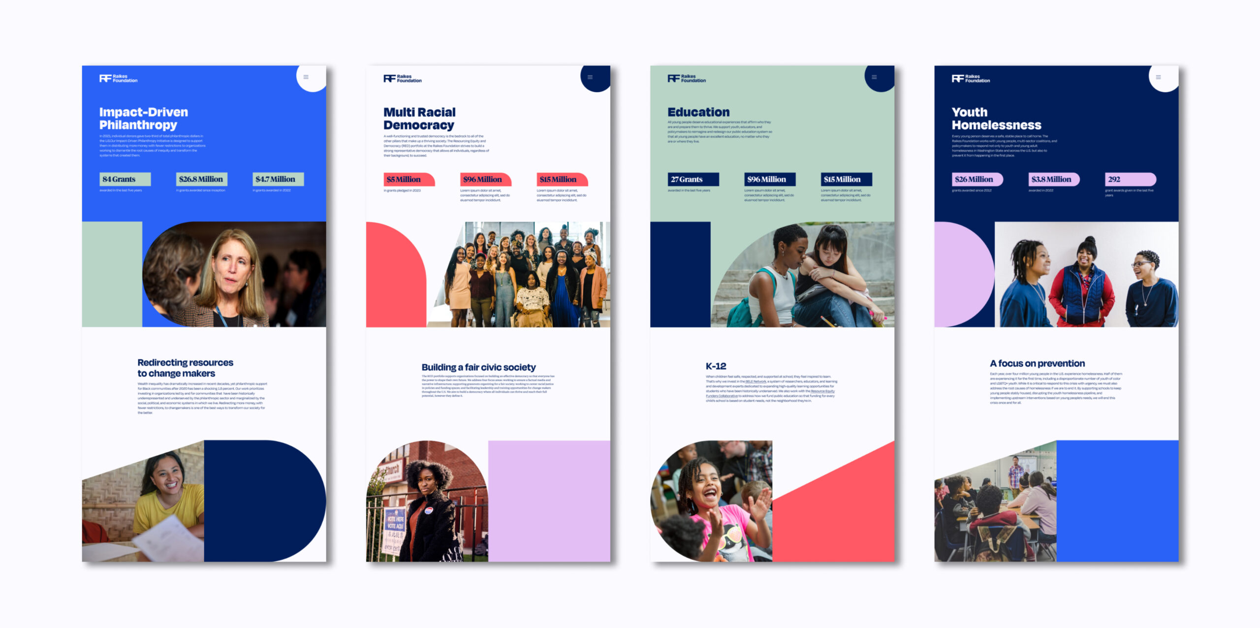
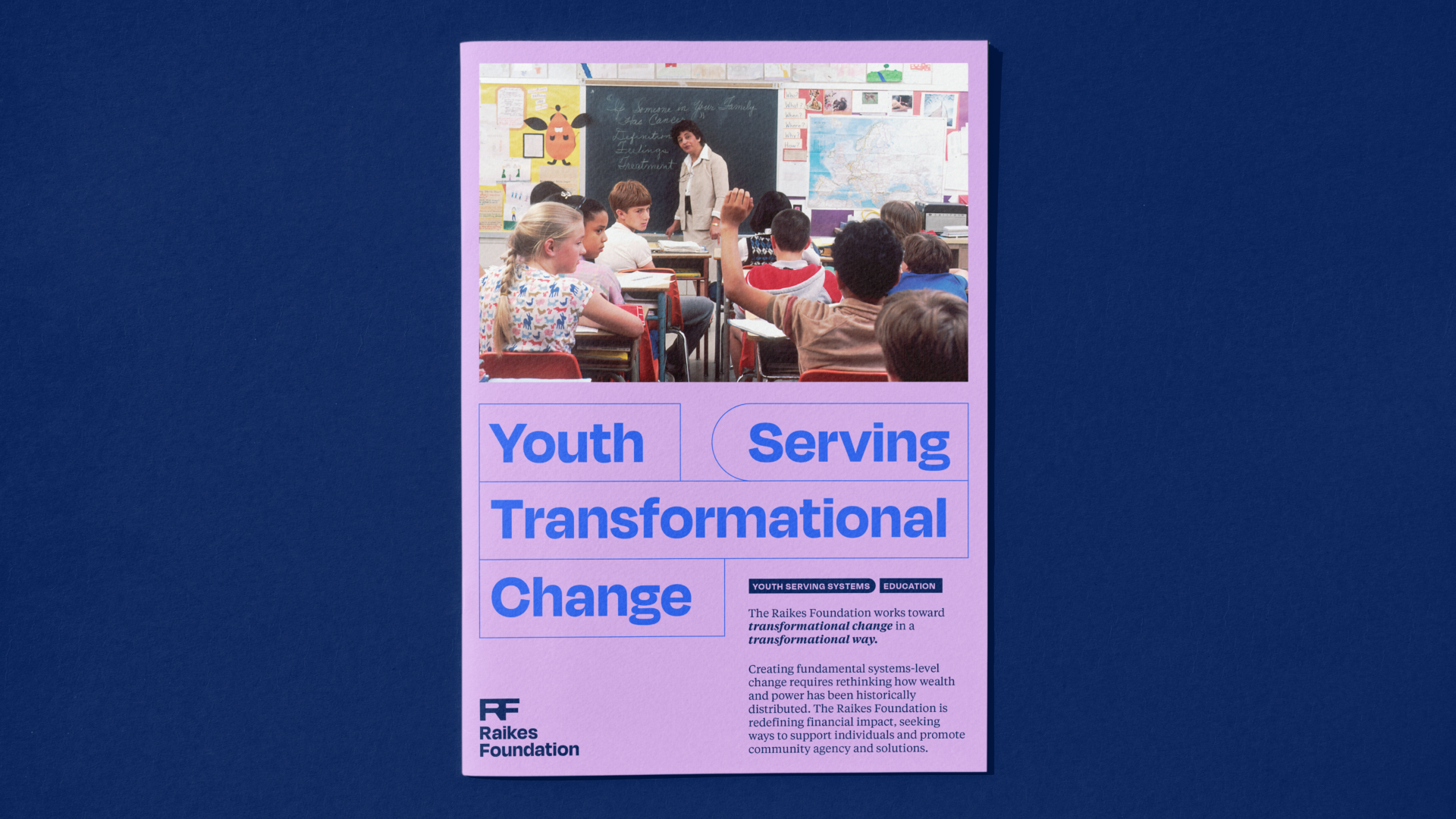
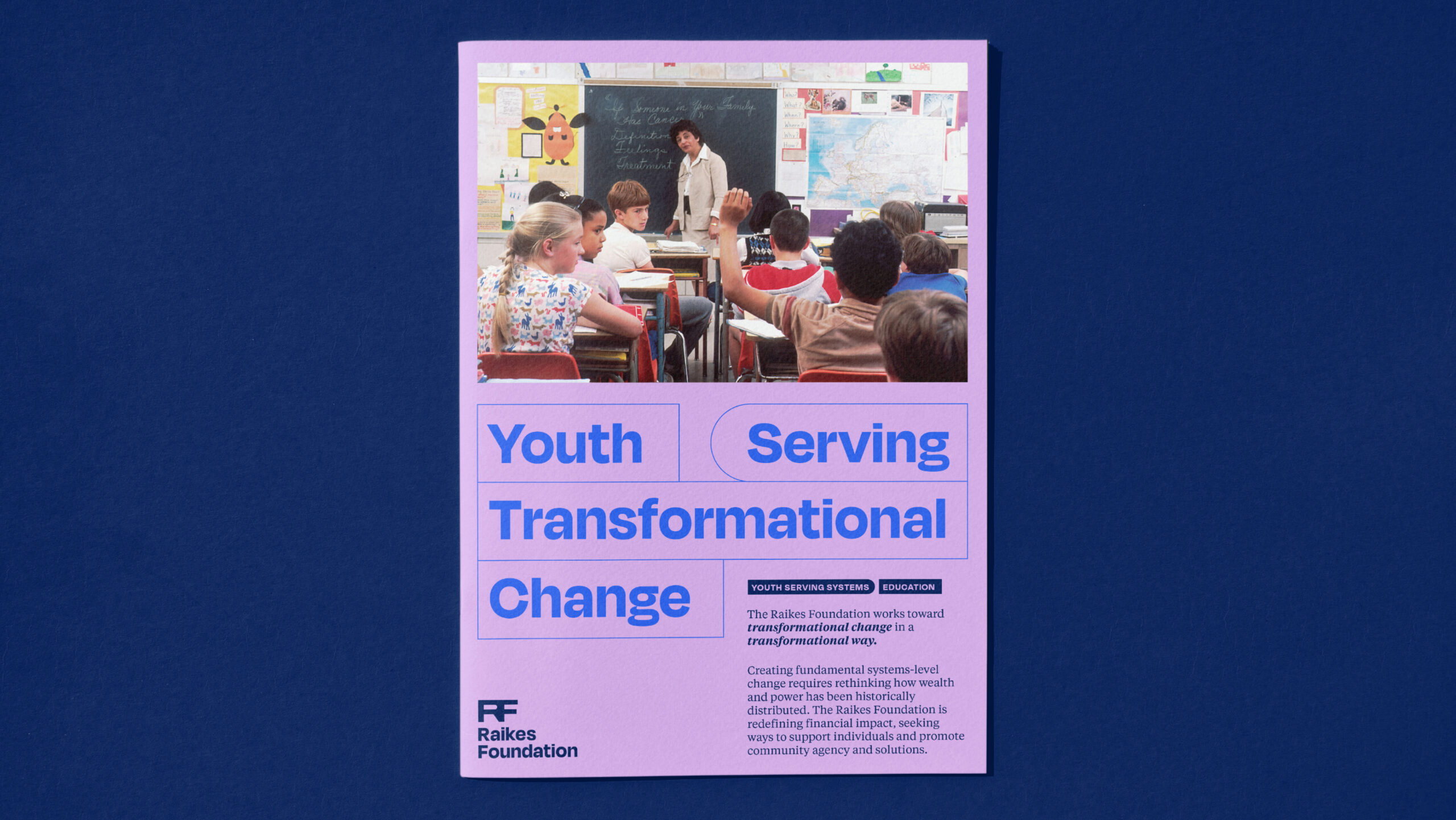
Website
We started this project with a deep understanding of the content hierarchy and structured the site in a way that is easily digestible for the user. The design of the site was guided by the bridge shapes that are core to the brand, and we used both the shapes as well as the bridge concept to inform details like UI animation and navigation. Our web and brand teams collaborated closely to create a cohesive product from print to web— strengthening and emboldening the overall look of the rebrand.