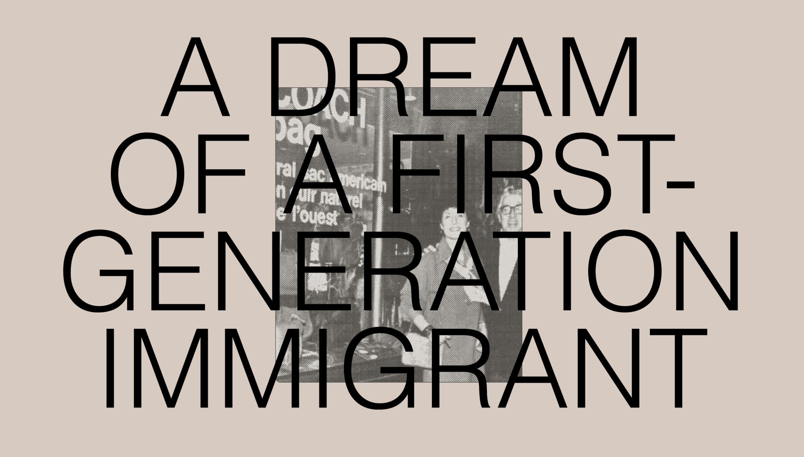
Coach Coach Foundation
Overview
The Coach Foundation, backed by the iconic New York City fashion house, charged Ghost Note with the task of creating a bold, bright, gritty brand to match the authentic creativity of the young people they serve. This assignment, for us, represented an opportunity to uplift historically underrepresented youth through continually developing new ways to support and inspire their studies, passions, and limitless futures.
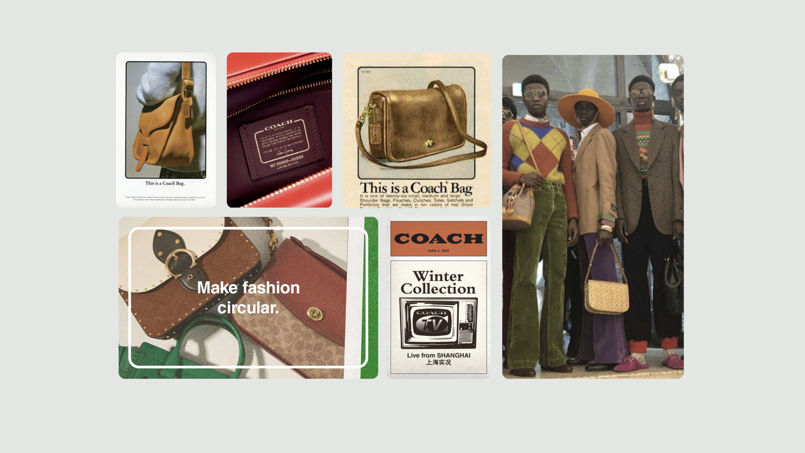
Challenge
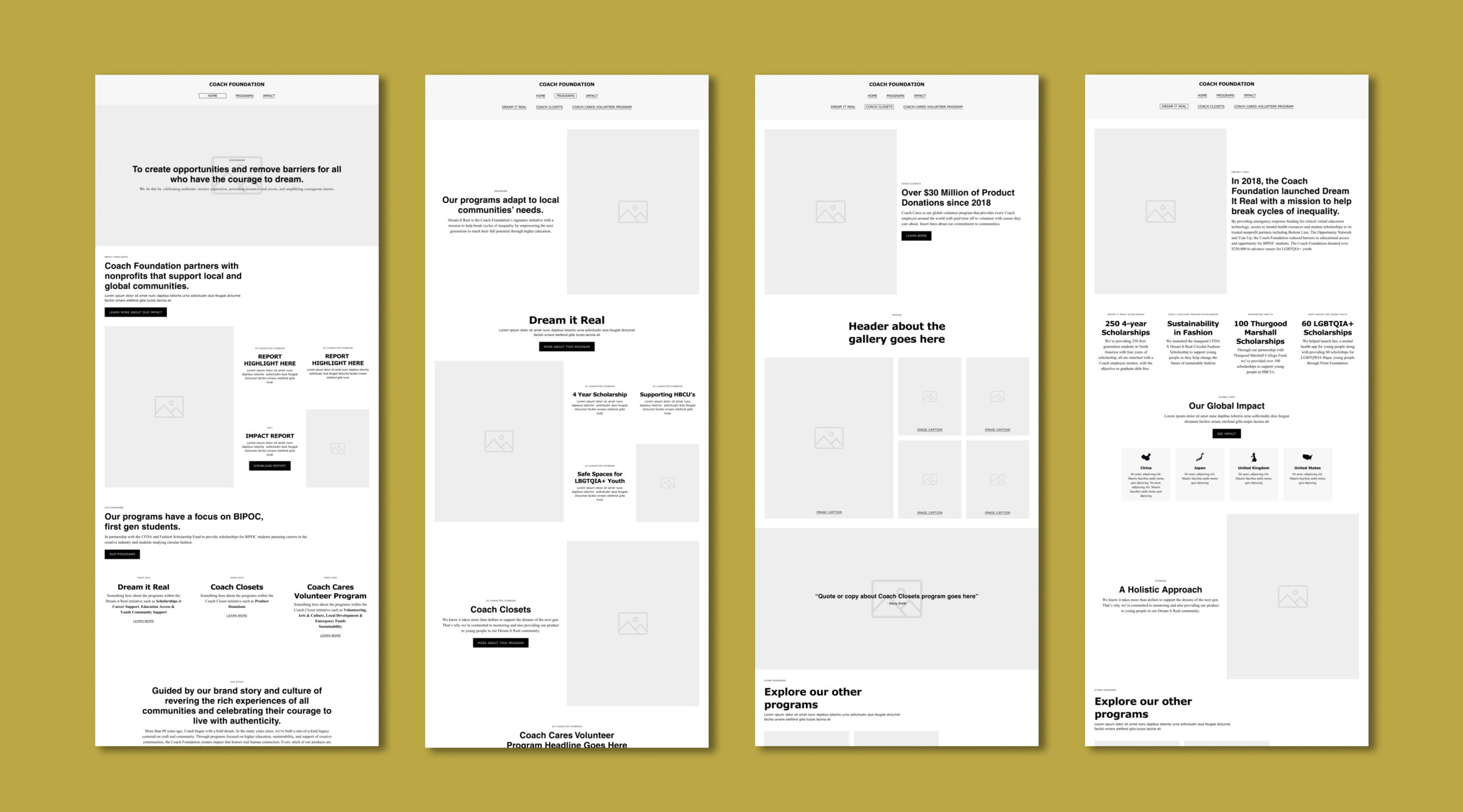
Creating a sub-brand for a fashion giant presented a unique opportunity to celebrate their legacy while inviting in space for the next generation, who is served by the Foundation. The challenge was to incorporate key visual components of the existing Coach brand and flex for different audiences—from Gen Z on Instagram to Boomers on Non-Profit Boards— resulting in visuals that have range from simple to complex.
The Logo
The primary logo for the Coach Foundation is simple and foundational. The wordmark is driven by the iconic Coach logo, while being supported by a secondary typeface called Monarcha. The type pairing provides a youthful yet sophisticated edge to the final look—mimicking elements of the Coach logo, while creating contrast in its square uniform letter forms.
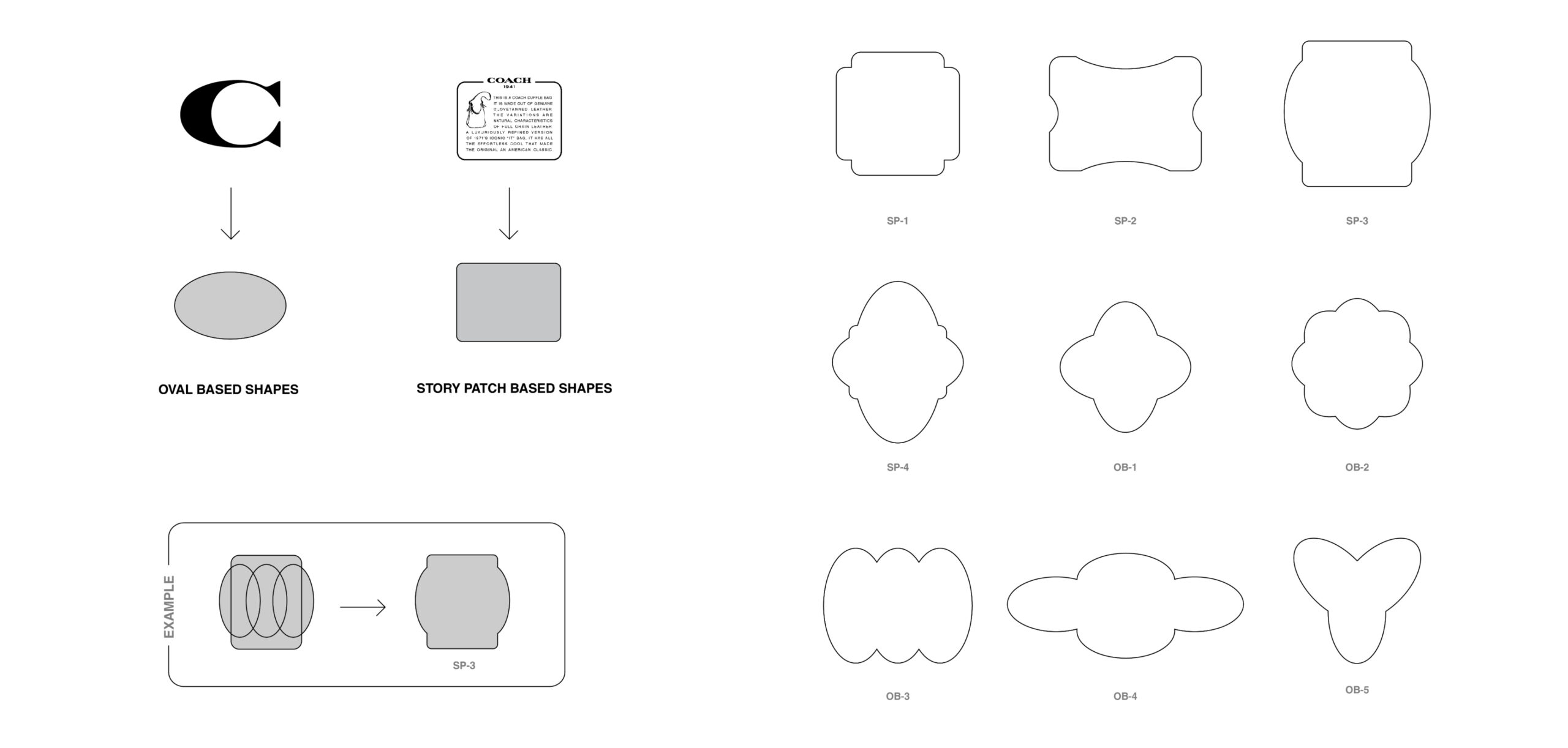
Creating The Frame
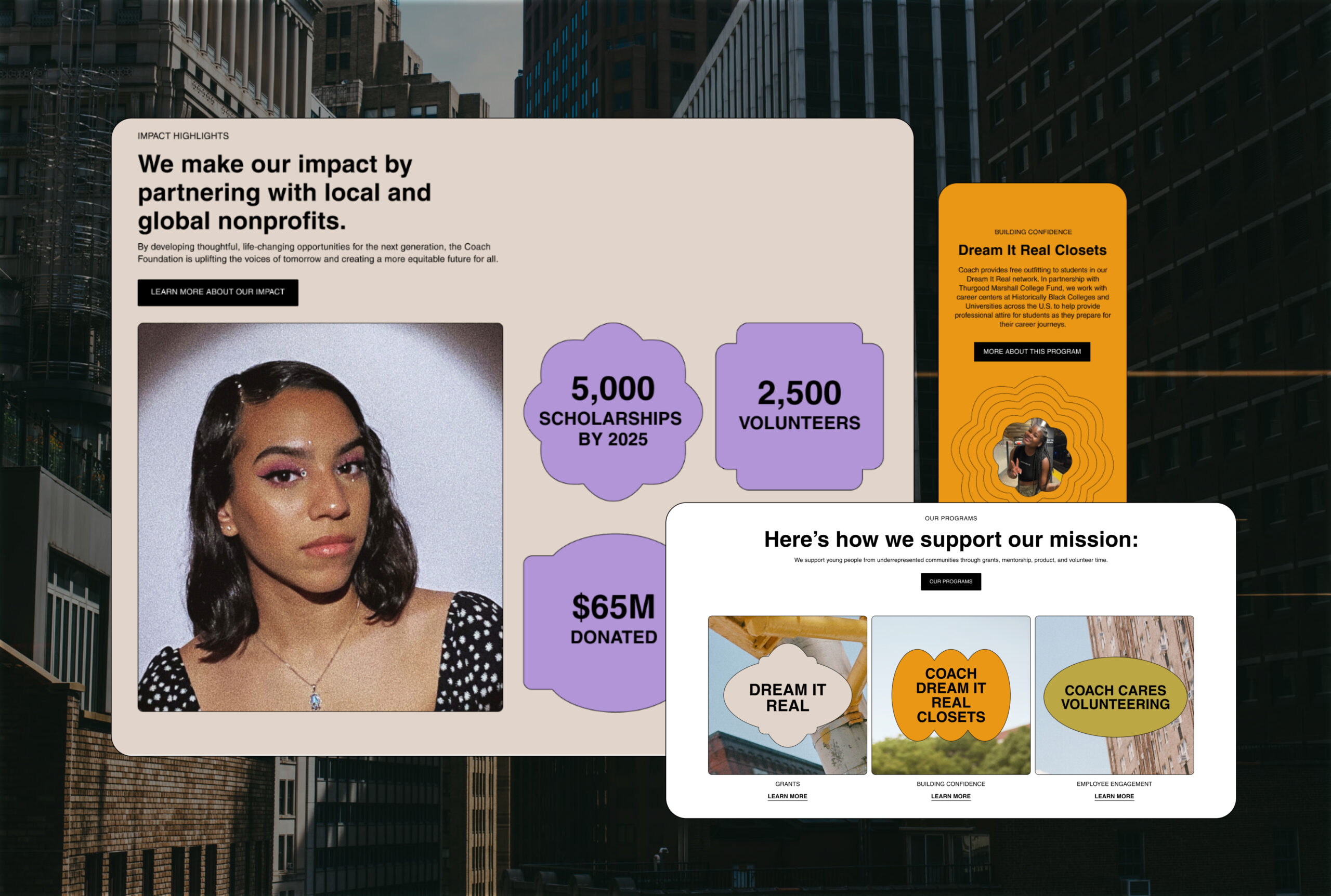
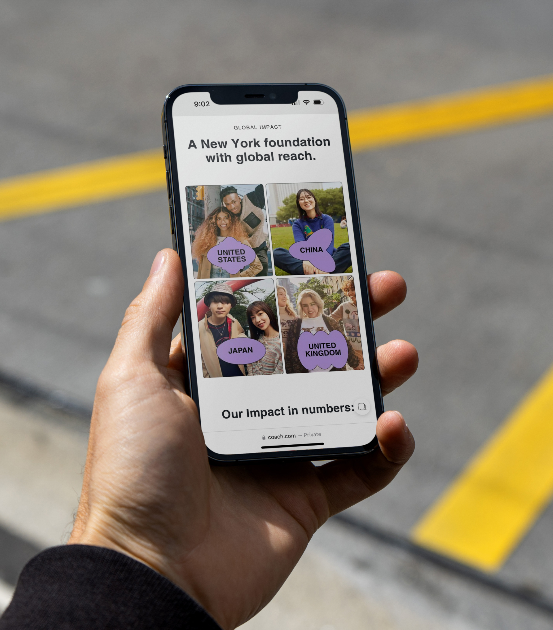
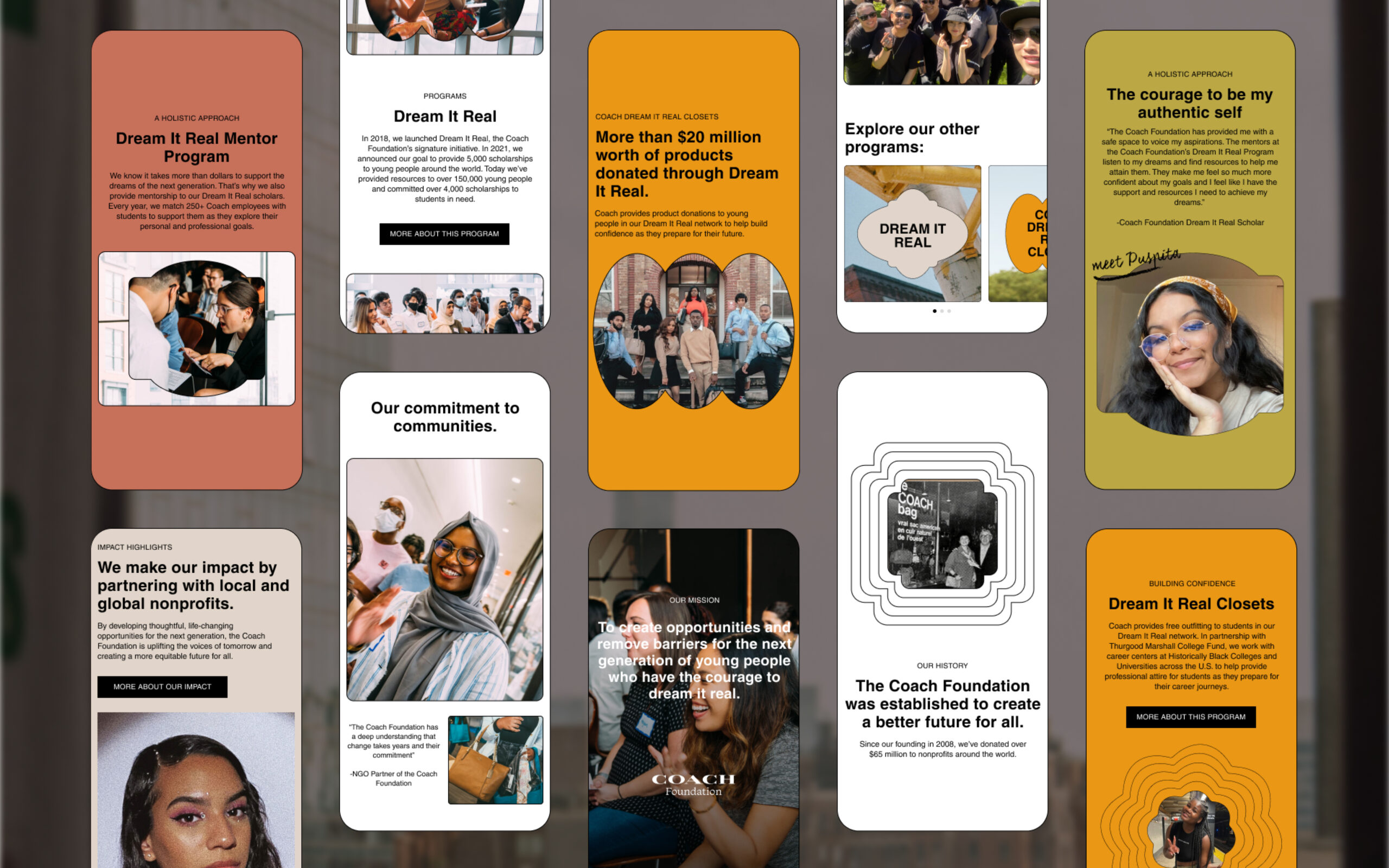
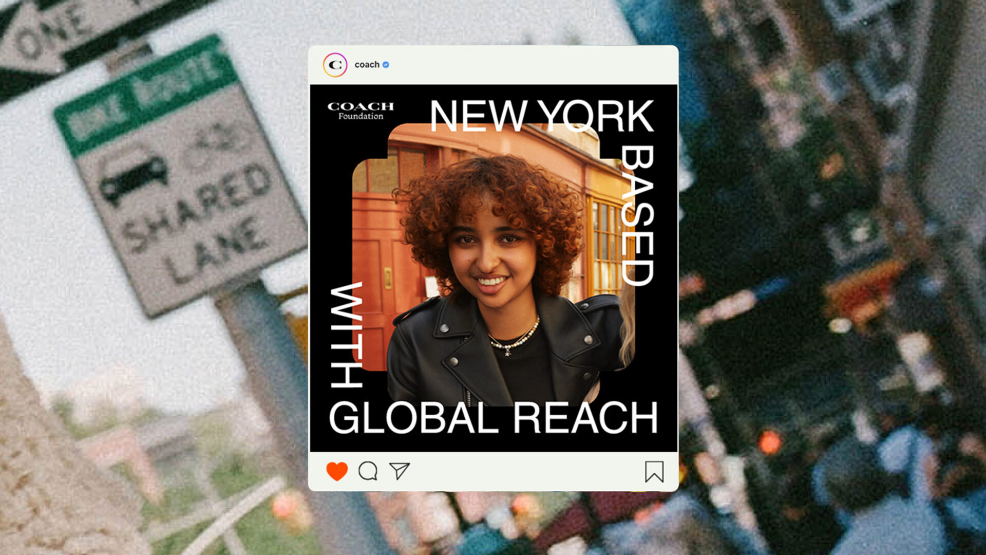
The Coach “C” and Story Patch are iconic and widely-recognizable marks in the Coach brand. Using the shape of these elements in various combinations and configurations, we generated a series of unique shapes that can be used as graphic assets, accents, or photography masks.
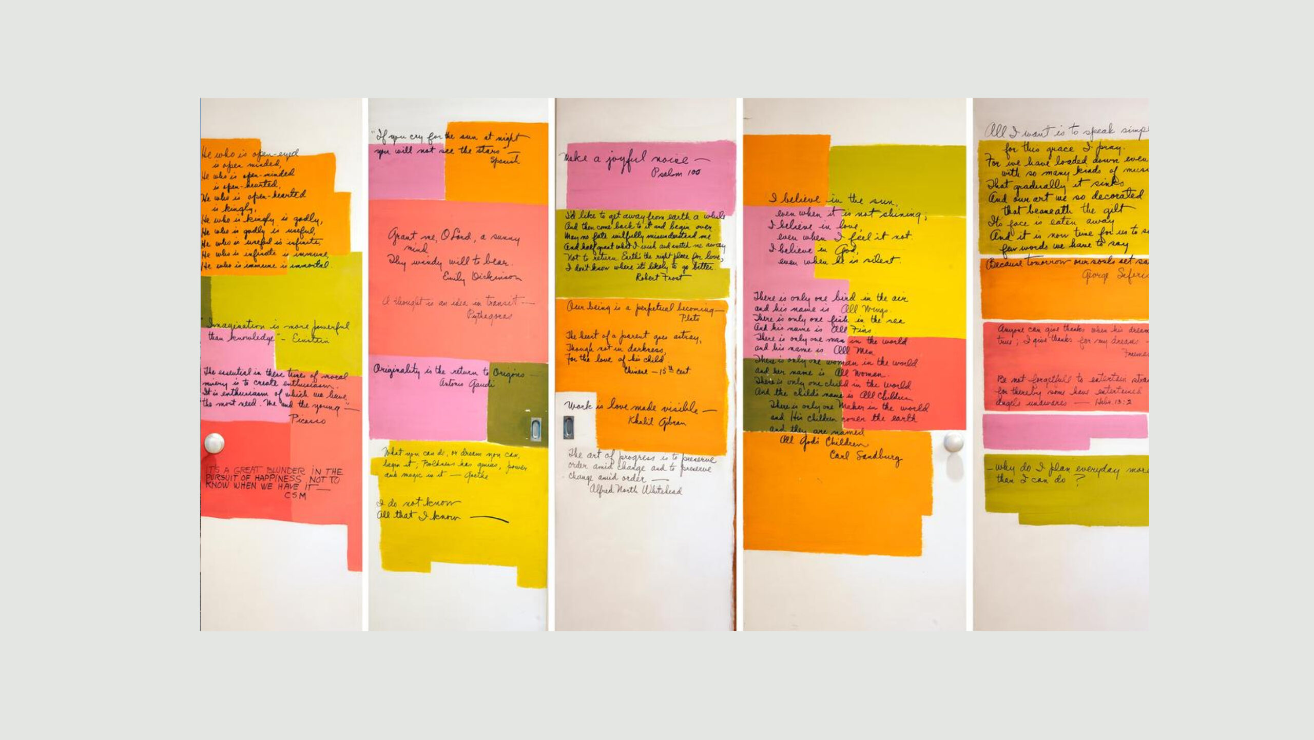
Inspiration
Sketches from the New York apartment wall of Coach’s first Creative Director, Bonnie Cashin
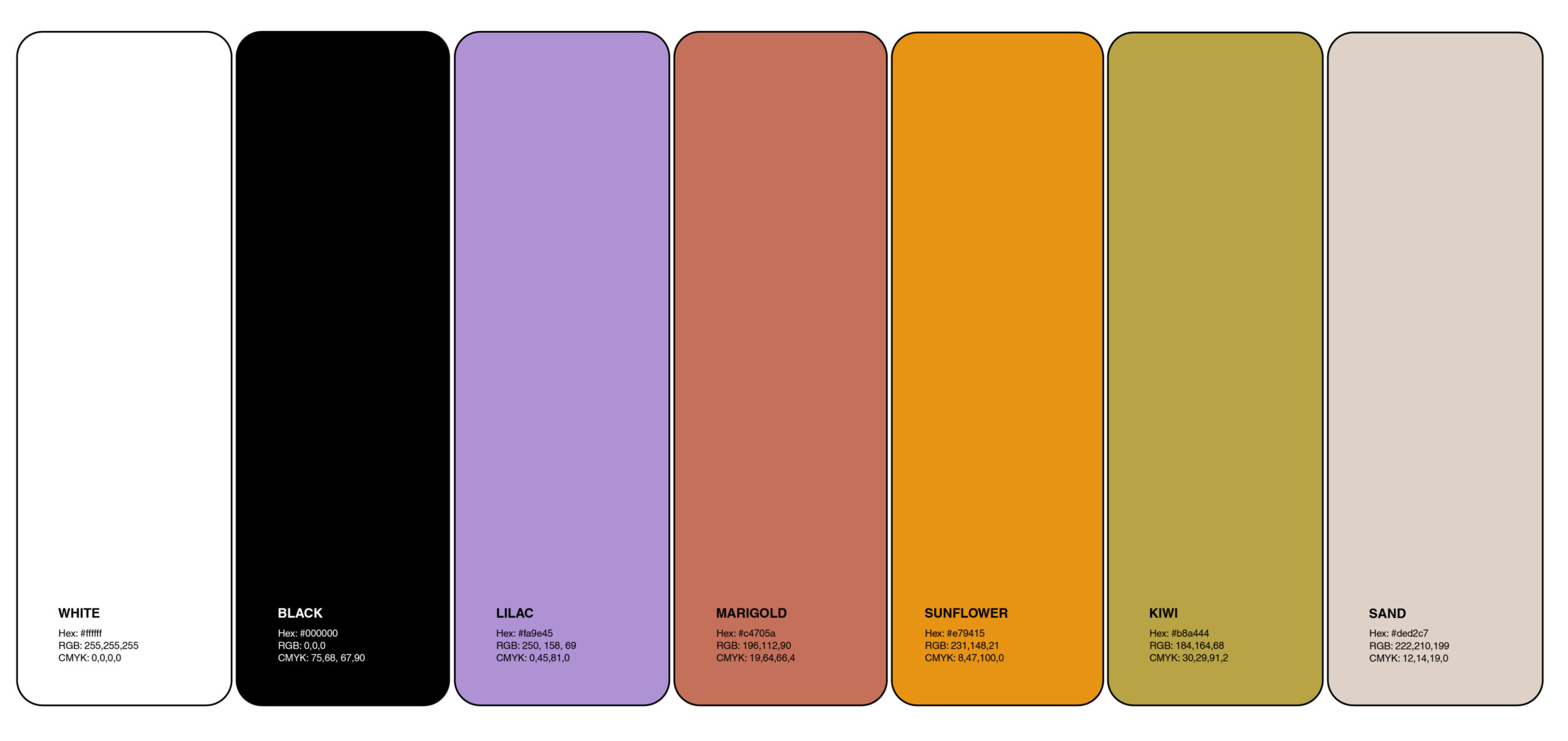
The Colors
A Nostalgic Pallate
Referencing an image of paint swatches from the apartment wall of Bonnie Cashin, Coach’s first Creative Director, we created a warm and approachable palette that balances vintage with modern. The palette is based in black and white, and uses accent colors and vibrant photography to bring color to the brand. We imagine a limited palette of modern neutrals paired with a few brighter tones used selectively as accents.
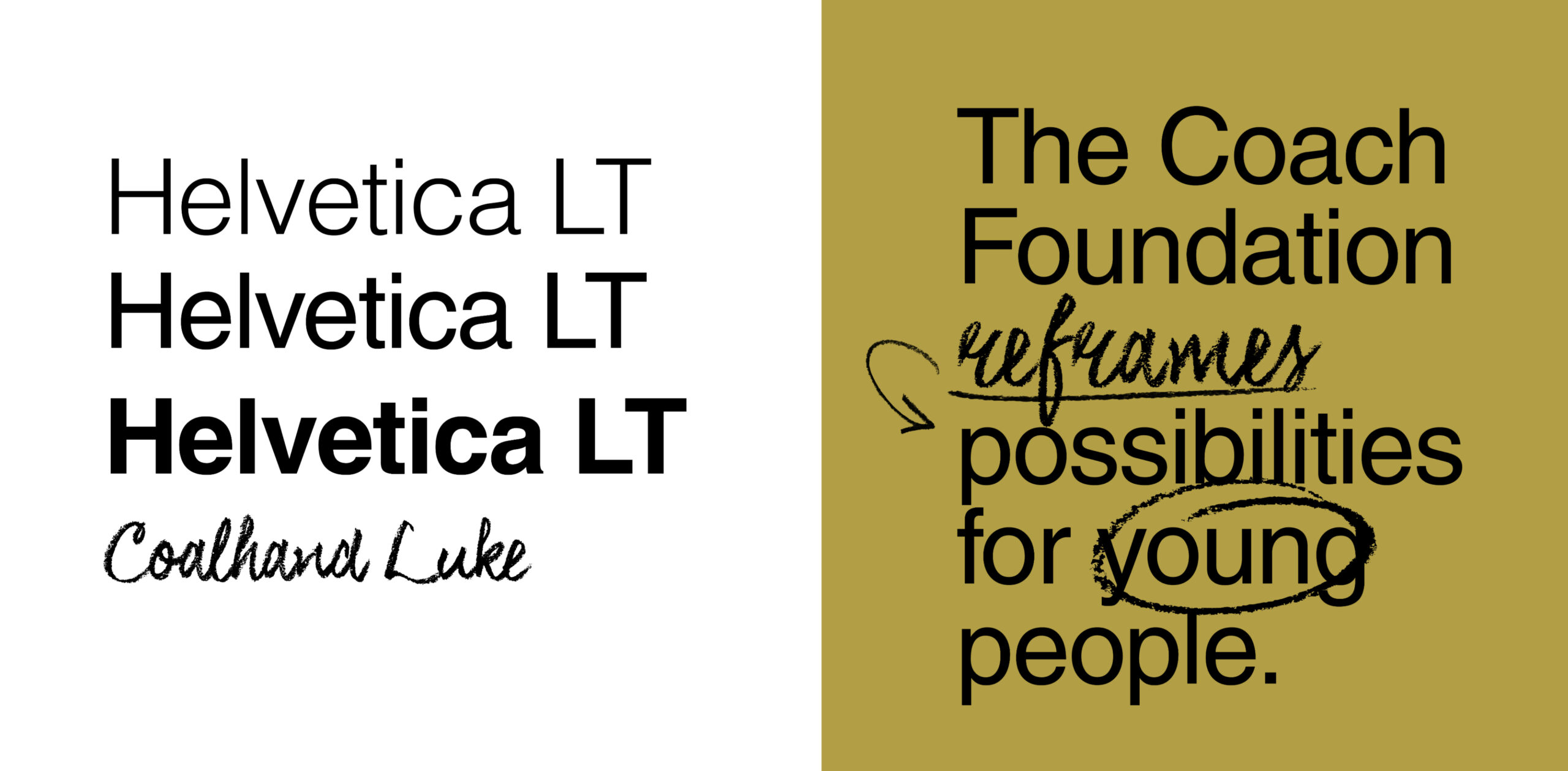
Fonts
Helvetica LT Pro is the workhorse of the Coach brand and the Foundation shares this legacy type. Coalhand Luke, a secondary font used for accent purposes, adds texture and a pop of youthful energy to the overall look.
Building Flexible Systems
The Coach Foundation’s voice carries through many different rooms. We needed a system that was fluid enough to speak effectively from corporate board rooms to Gen Z. We focused on forms that shift perspective, enhance focus and accentuate the art it encapsulates. This visual language highlights Gen Z as a focal point to be admired— a dynamic system that flexes to best fit each unique subject.