Smithsonian’s Anacostia Community Museum
Overview
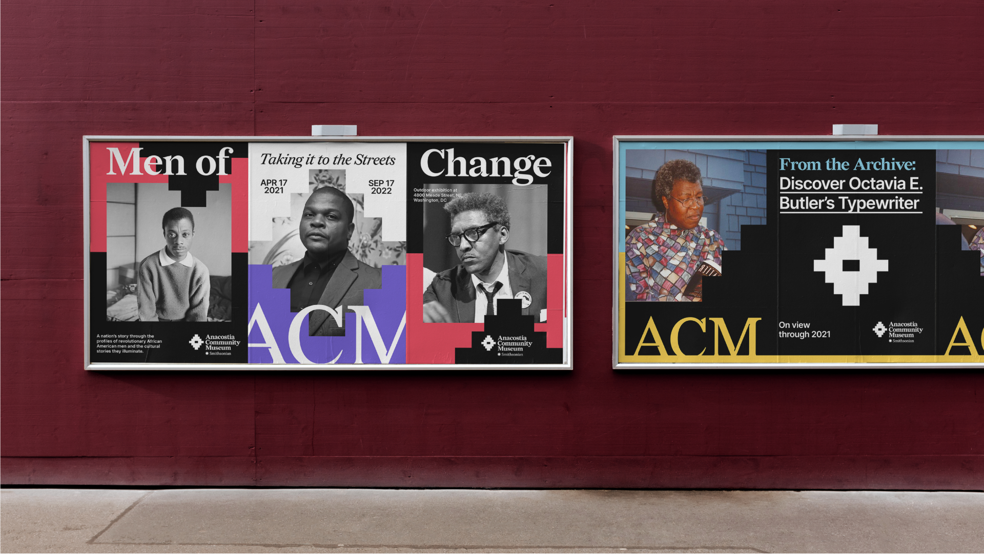
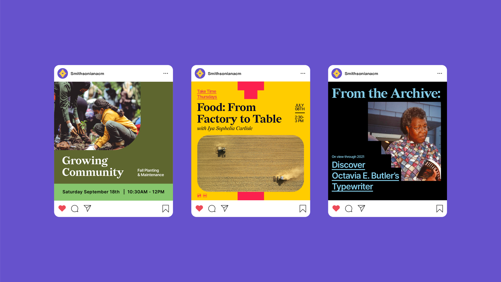
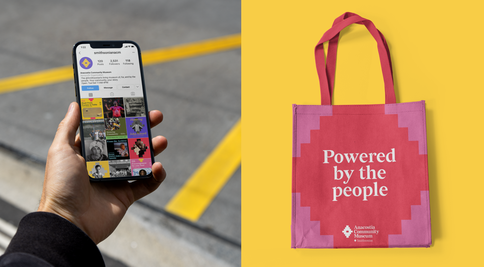
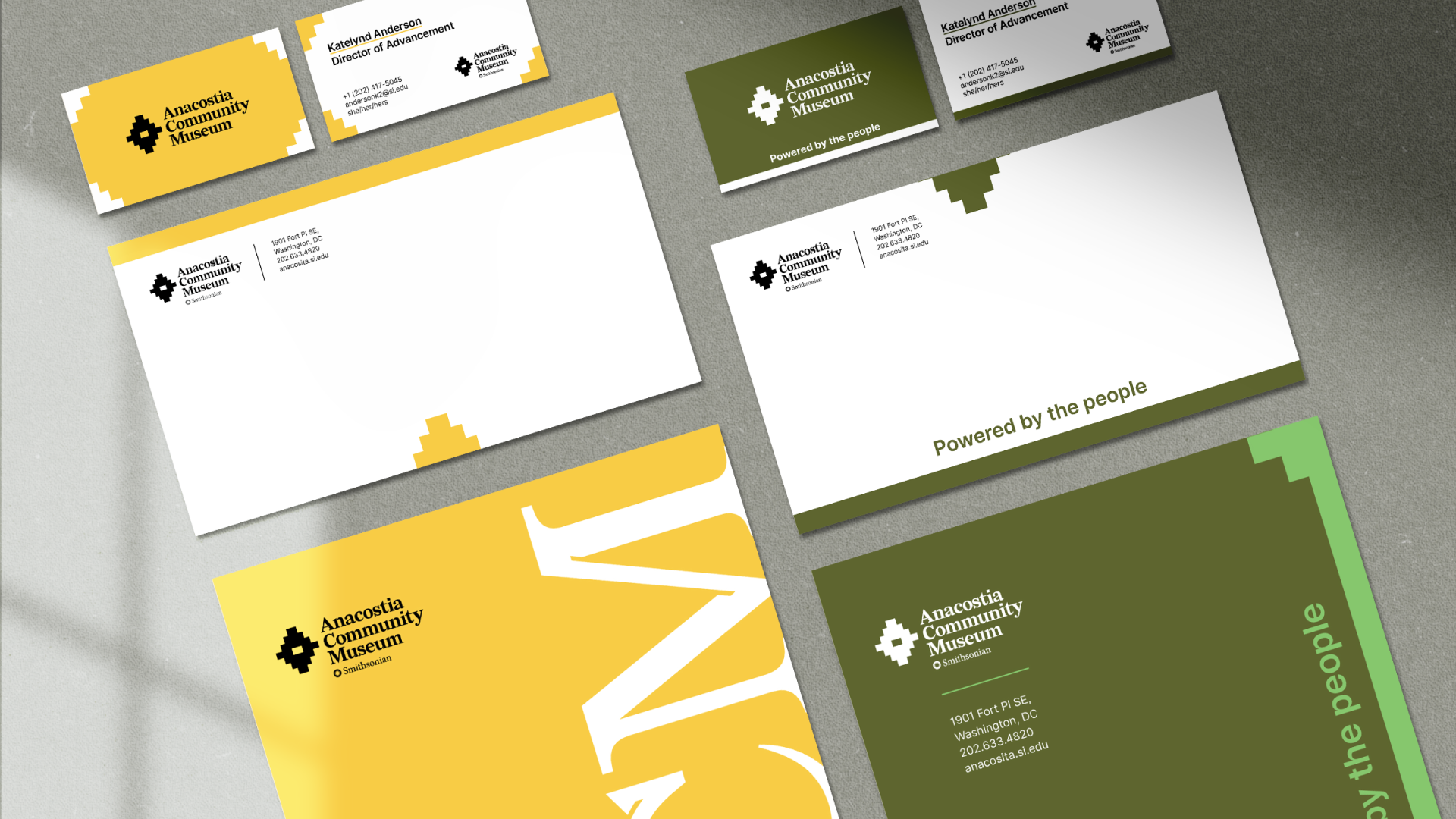
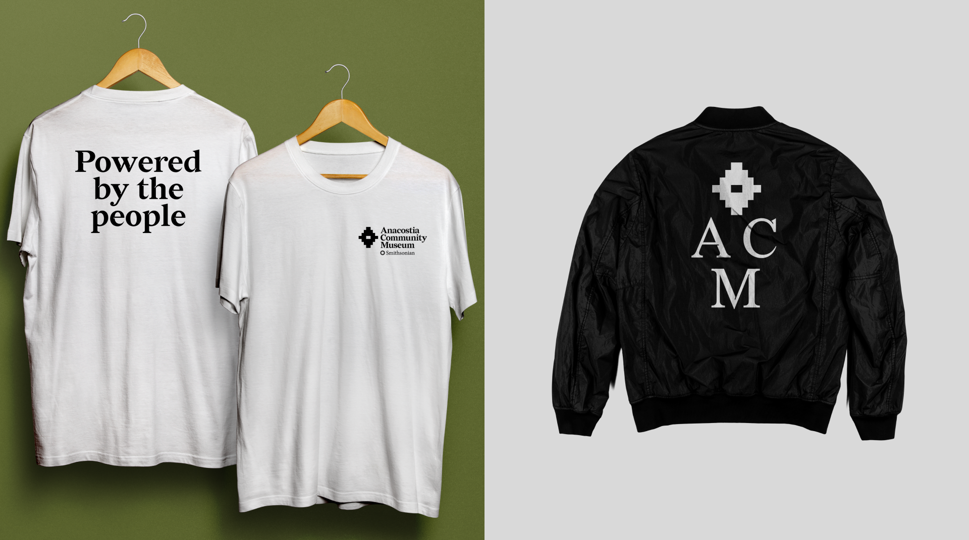
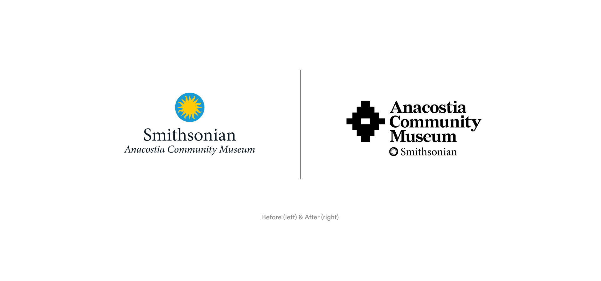
For the ACM, Ghost Note developed a new brand and visual identity, inspired by the design and history of the museum. To support the new look and feel we created a launch strategy that included a social media rollout, a high-touch brand relaunch video, print, out-of-home and pop-up activations. Additionally, the new “Powered by the People” tagline embodies the energy of the museum and the dedication shown by the community for ACM since 1967.
Challenge
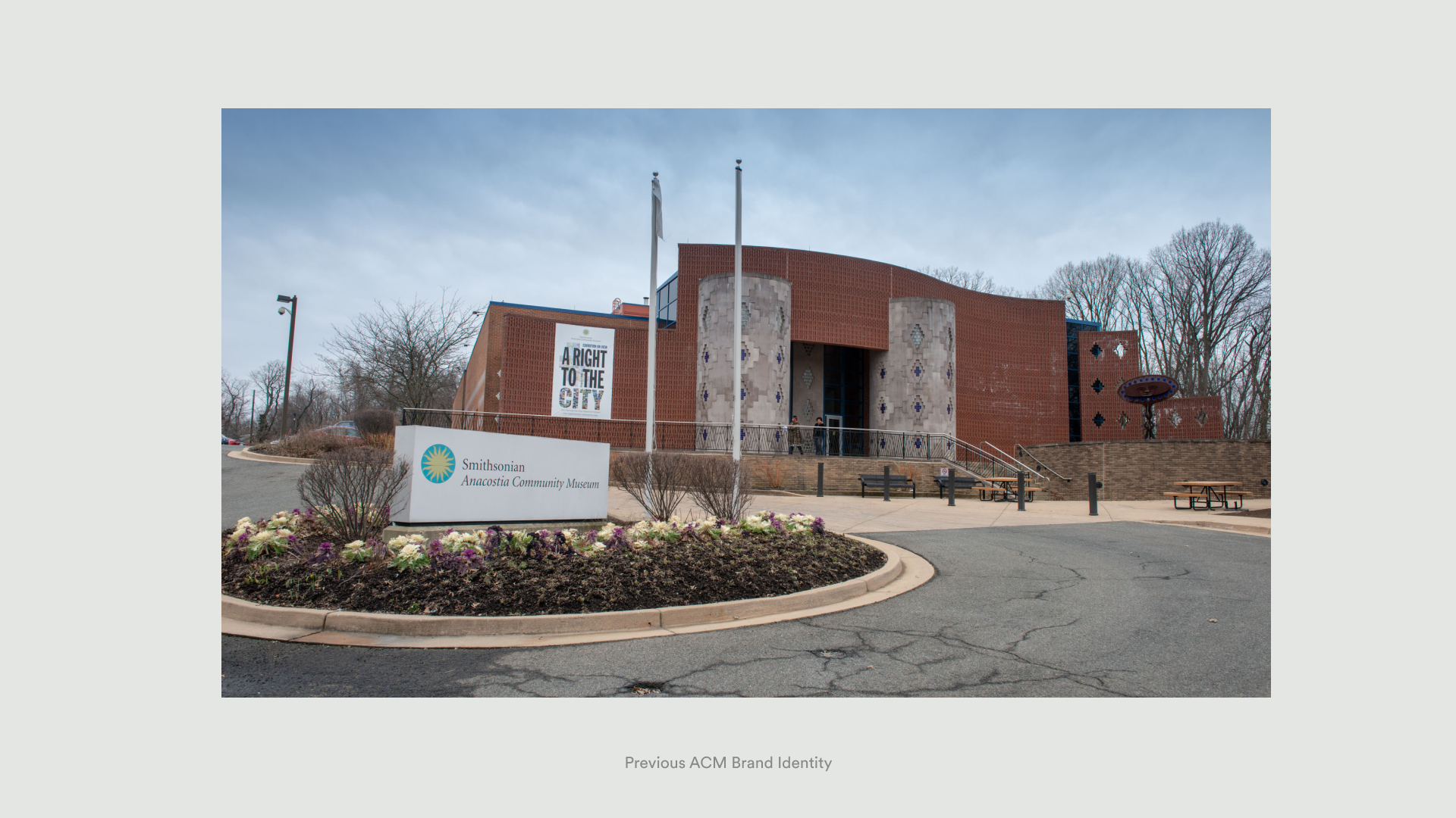
The Anacostia Community Museum was in search of a rebrand – a new identity that showcased its position as a trusted source that preserves, documents and presents contemporary urban experiences to inspire the people of Anacostia, D.C. and the United States.Along with the visual ID we were tasked with developing an effective strategy to introduce the new brand to Anacostia and the wider D.C. community. The journey to develop the new ACM brand took us back in time and through the design history of the museum itself, which informed what ultimately became the new Anacostia Community Museum brand.
Brick Mark Inspiration
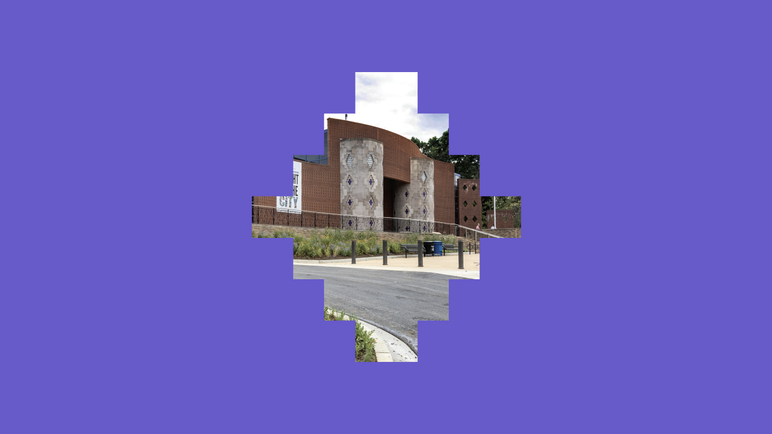
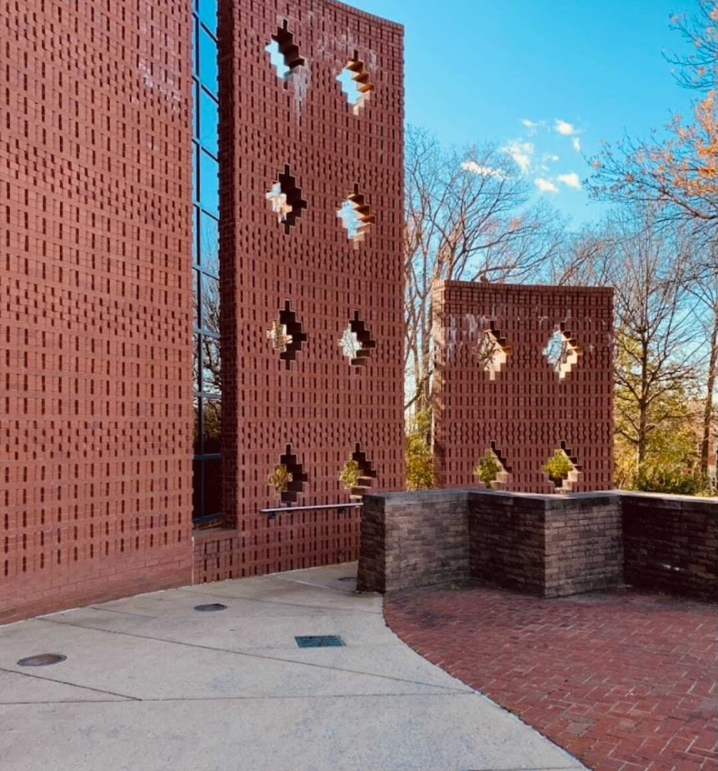
The Anacostia Community Museum finds itself at the intersection of history, place, and community. The decision-making behind ACM’s brick mark was inspired in part through architectural references to the ACM exterior facade, and the kente cloth shapes that decorate it.
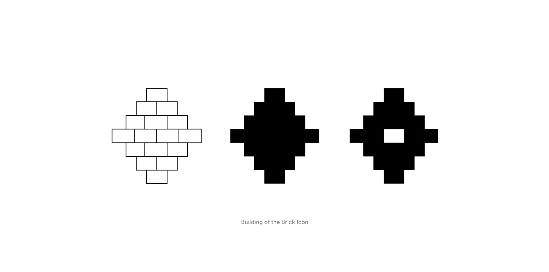
Building Anacostia
Utilizing building block motifs, the mark’s frame of reference can slip from architectural to social. Much like the community museum itself, the ACM brick mark marries the ideas of place, people, time & history, simultaneously looking to the past while firmly placed in the present and future.
The conceptual foundation for the ACM Brick Mark lies in the idea of “social masonry.”ACM’s Brick forms can simultaneously get at the idea of history, through architectural reference of the site, and community; a social building, constructed not as a whole, but of many individual, varying parts.
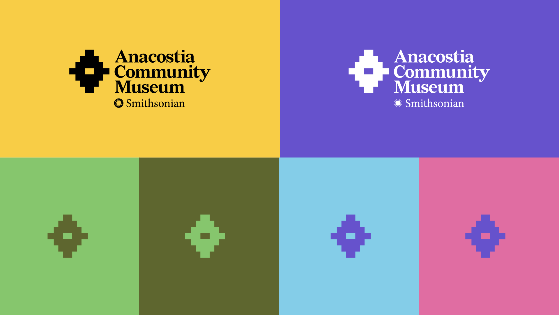
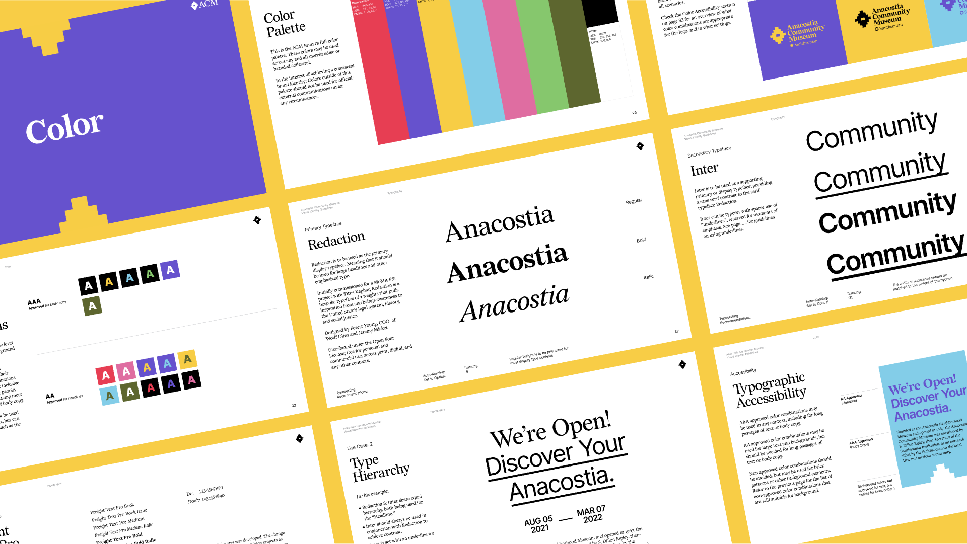
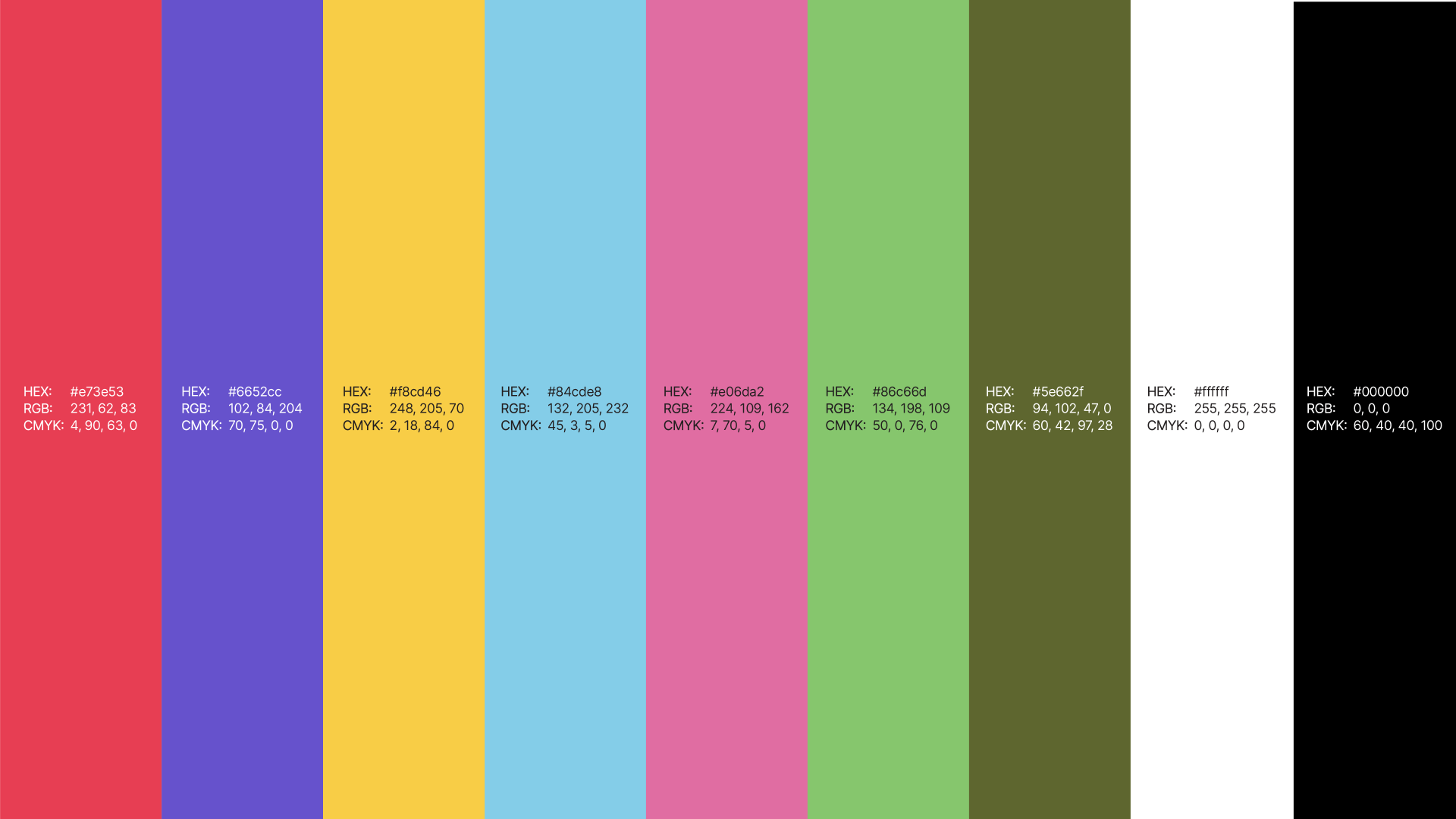
A Vibrant Palette
Revisiting our original inspiration of Kente cloth patterns, we wanted to create an energetic and vibrant palette that lifted up the ACM community. We wanted to speak to the various ways the community could engage with ACM – inside the museum, outdoors in the community, and online through its robust archive.
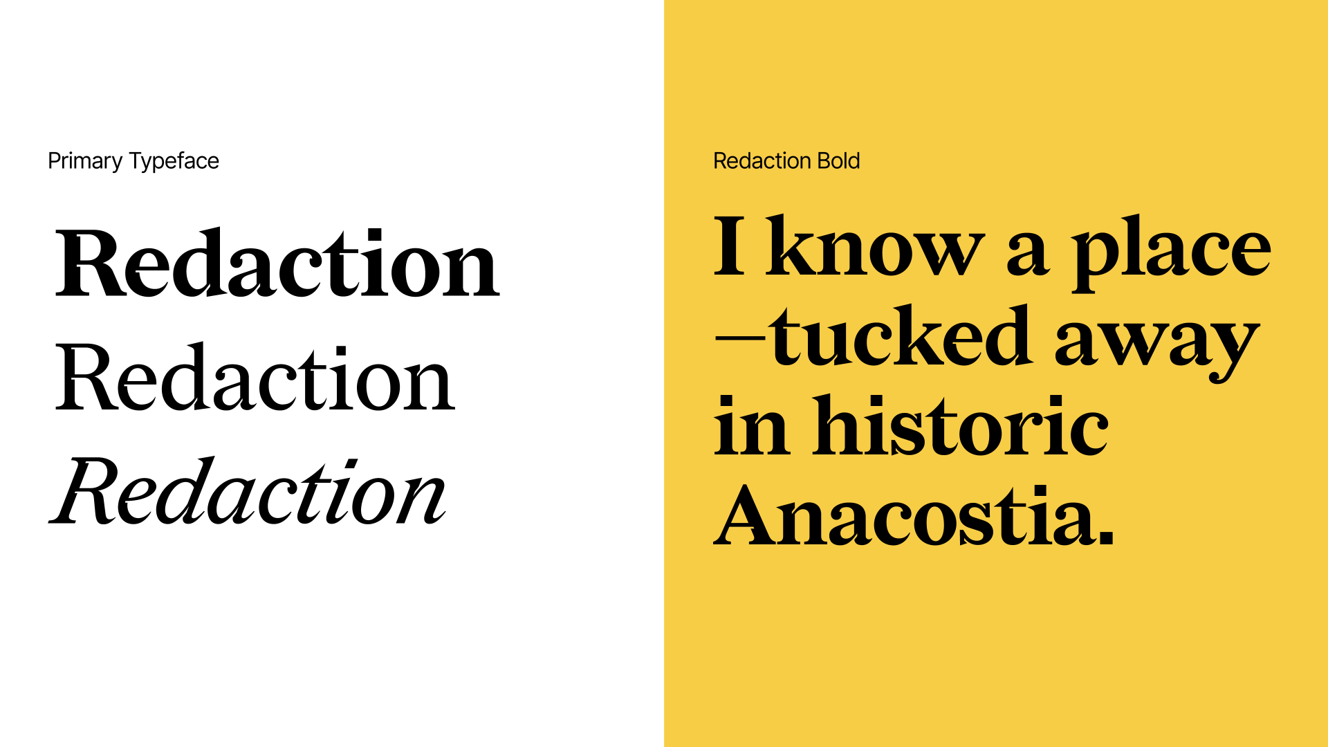
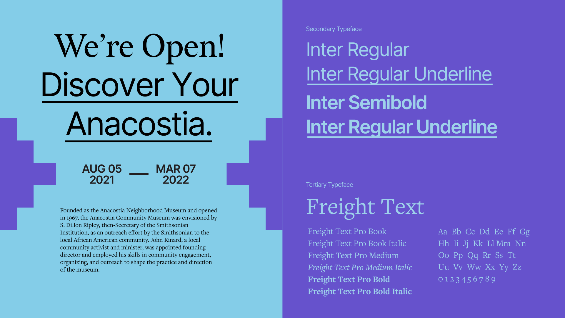
Typography
We chose Redaction (by Titus Kaphar and Reginald Dwayne Betts) as the primary typeface for ACM, for its foundation in history, the legal system and social justice. Redacation and it’s unique typographic forms are influenced by historical materials and the distortion and degradation of materials over time. As a museum rooted in community history, we felt it was a perfect match for the brand. Paired with Inter, the type system felt refined yet powerful in its tone of voice. We also included a custom feature of underlining for emphasis, in places where we may want to highlight or call out a certain detail.
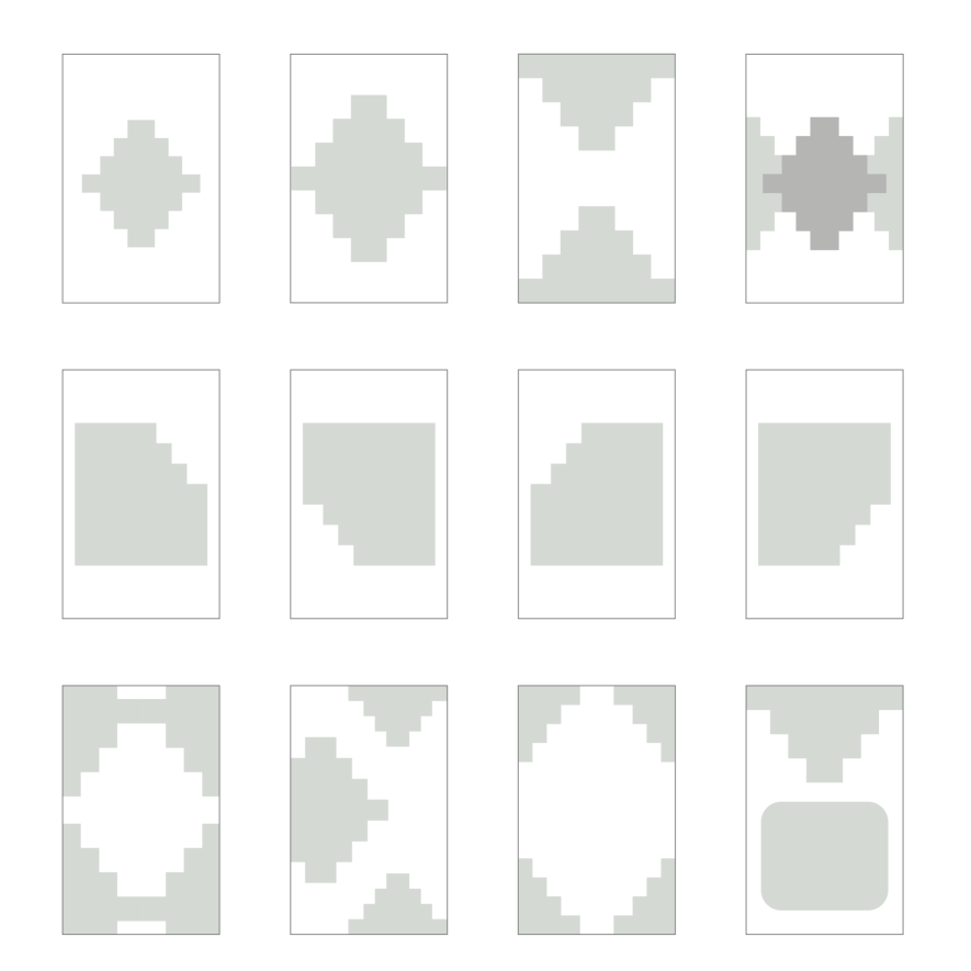
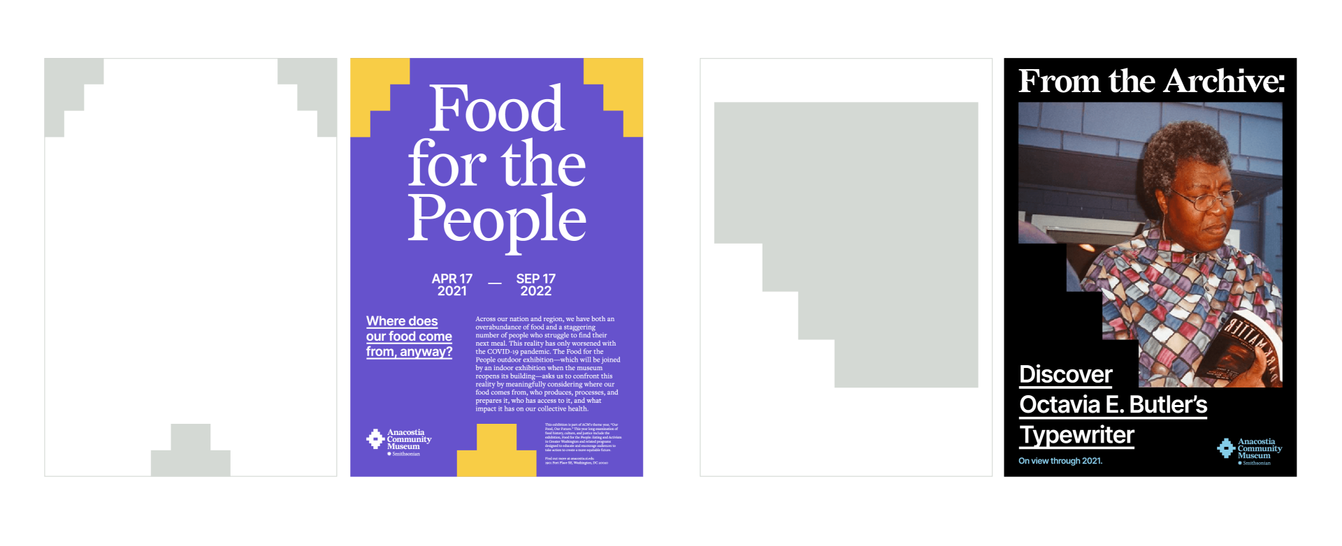
Brick Pattern Grids
“Brick Patterns” use of the shape of the Brick logo to form a basic structure for every expression of the brand. Using the brick, compositions can be as simple or as complex as the situation calls for. This layout system is flexible enough to be deployed across a variety of scales and forms in print or in digital media.